
Gradient Boosting
Ensemble: Yes
This is a machine learning technique for regression and classification problems, which produces a prediction model in the form of an ensemble of weak prediction models, typically decision trees.s
Hyperparameters
Hyperparameters are the parameters that are not learned by the model, they are set before the training process, to optimize the model, you can change these parameters to see how the model behaves.
| learning_rate: | 0.07000000000000002 |
|---|---|
| max_depth: | 2 |
| max_features: | None |
| min_samples_split: | 21 |
| n_estimators: | 475 |
| subsample: | 0.7000000000000001 |
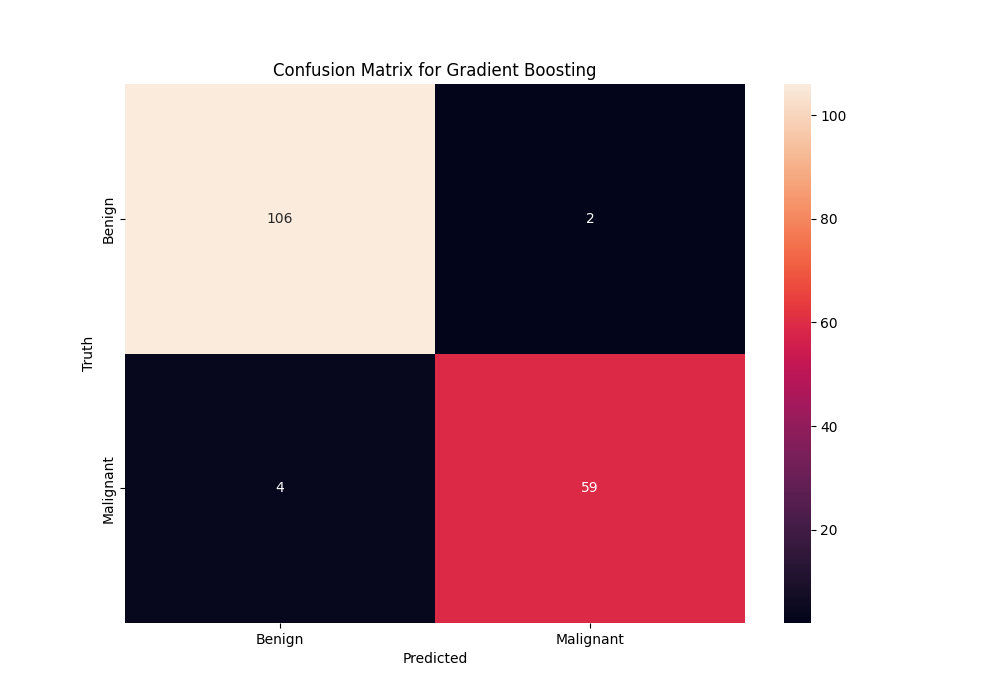
Metrics
Metrics let us see how well the model is performing, the confusion matrix shows us how many samples were classified correctly and how many were classified incorrectly.
| F1 Score: | 0.962 |
|---|---|
| Recall: | 0.959 |
| F2 Score: | 0.9602 |
| Balanced Accuracy: | 0.959 |
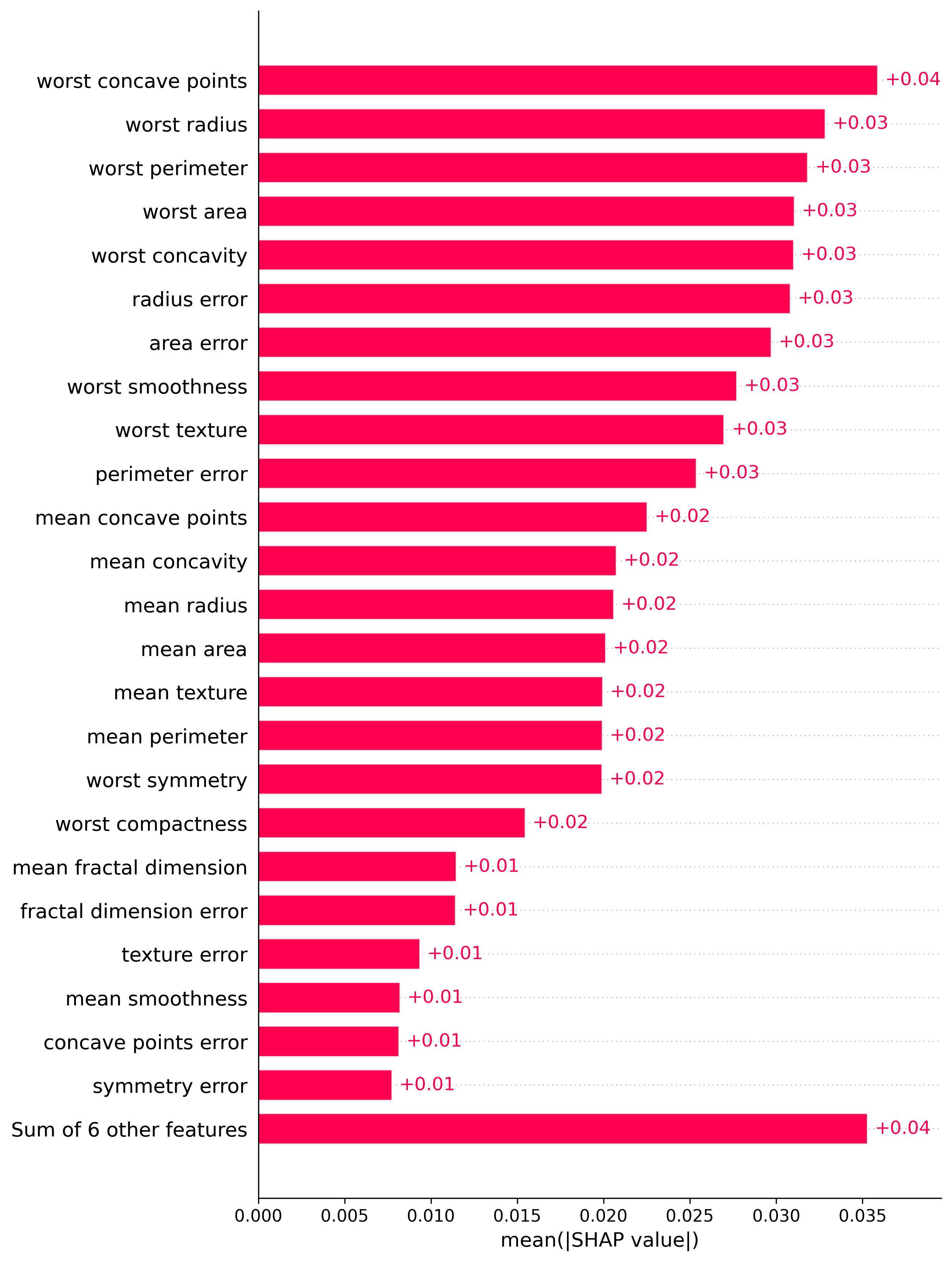
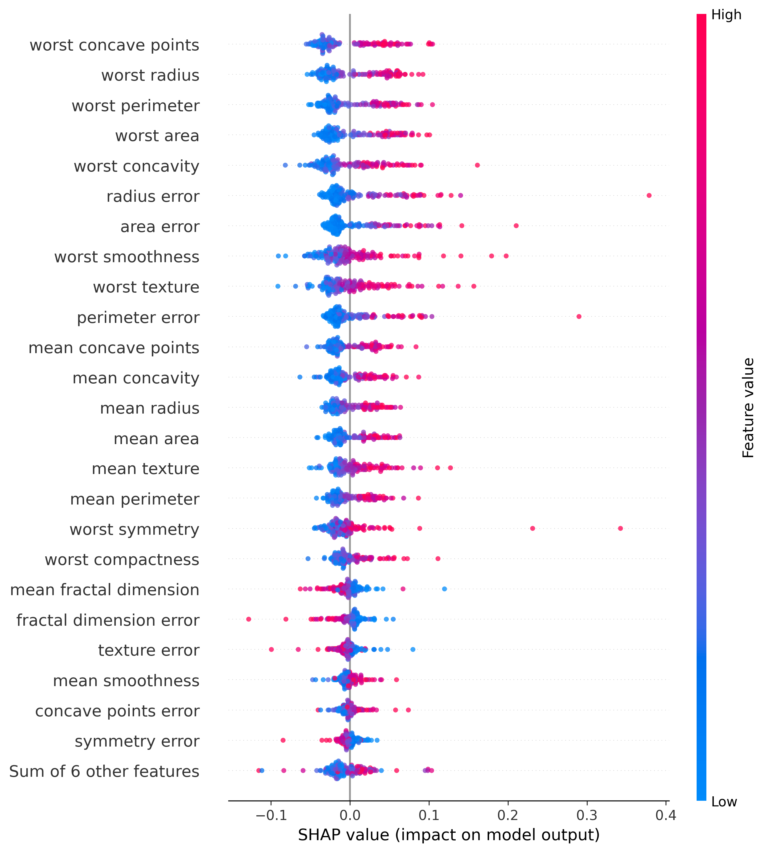
Feature Importance
In both plots the features are ranked by importance, with the most important feature at the top.
The second one, the beeswarm plot, shows the distribution of feature importance for each feature, each dot represents a sample, the color represents if the value was high or low, and then if it is to the left or right of the mean indicates how important that feature was for the decision, the more to the right the more malignant the sample was, and the more to the left the more benign it was.
Bar Plot
Beeswarm Plot
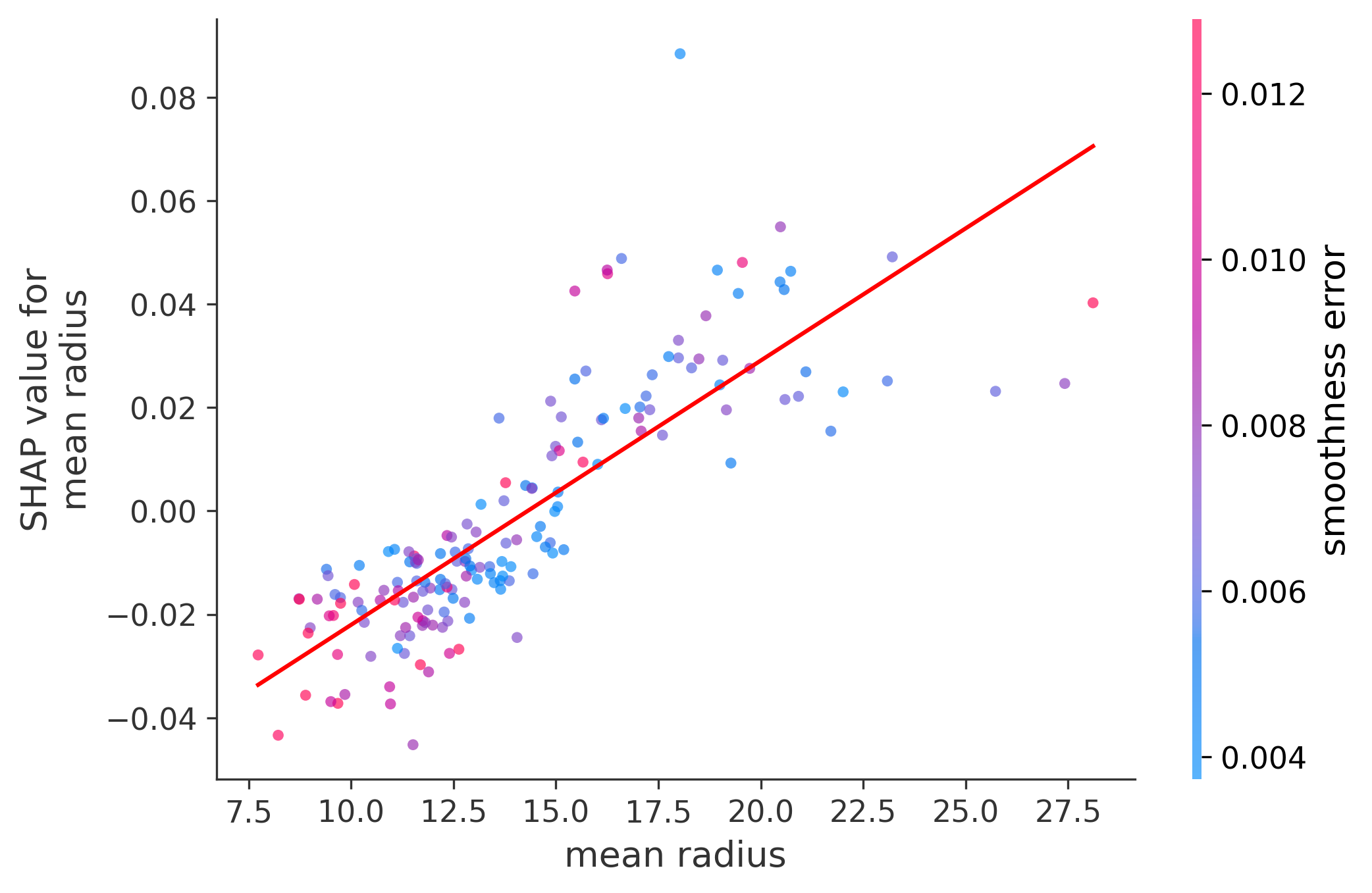
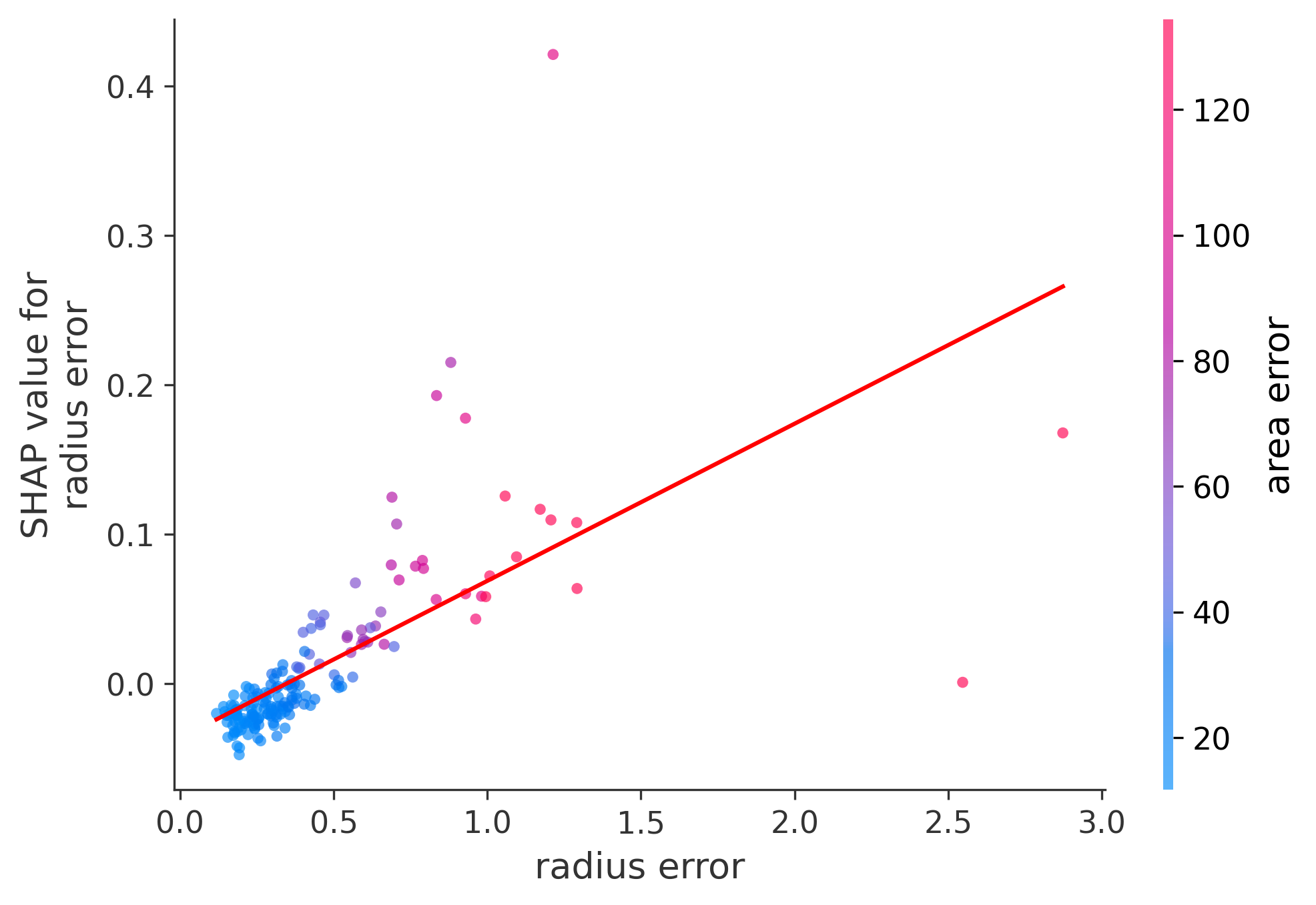
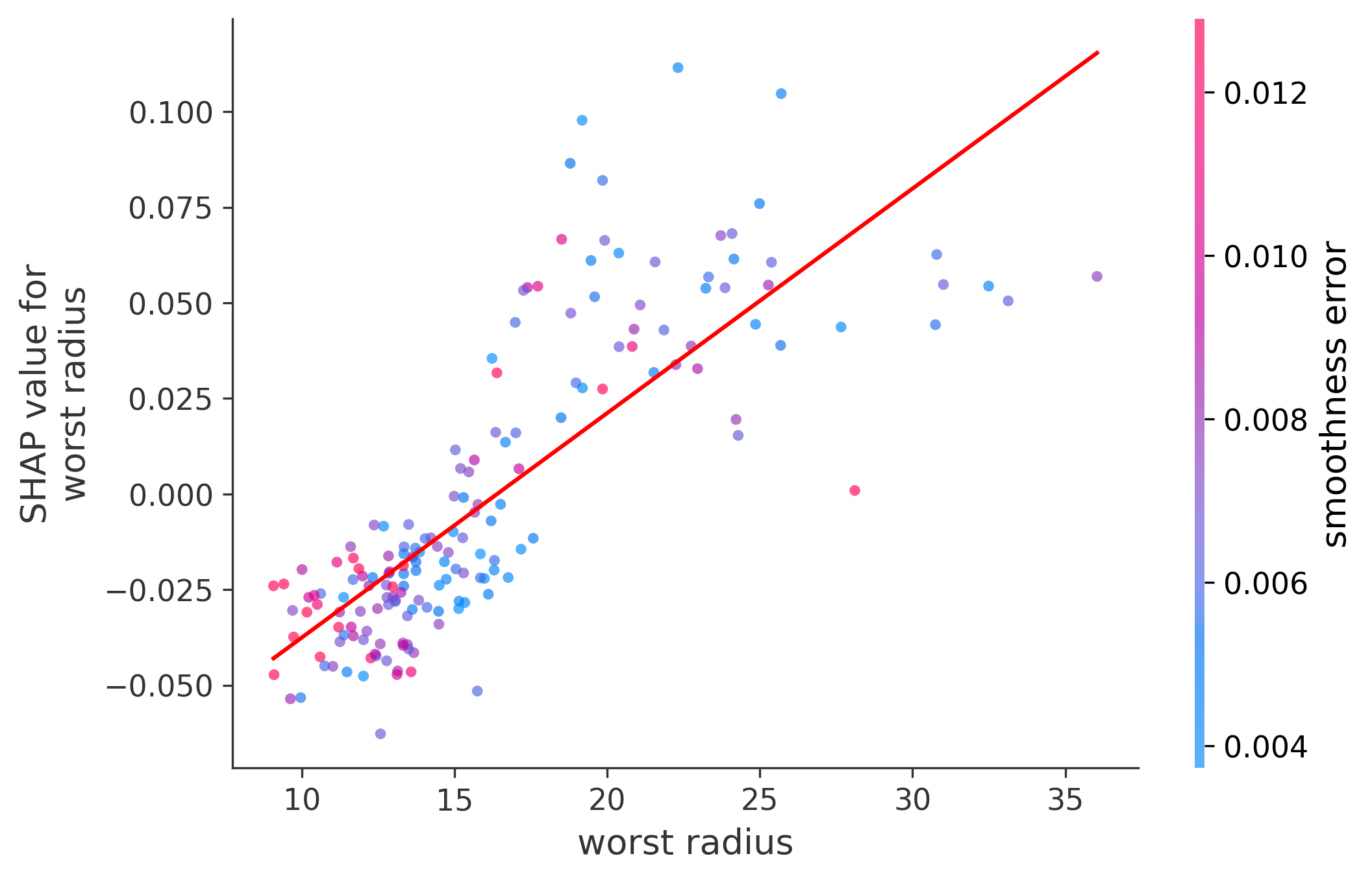
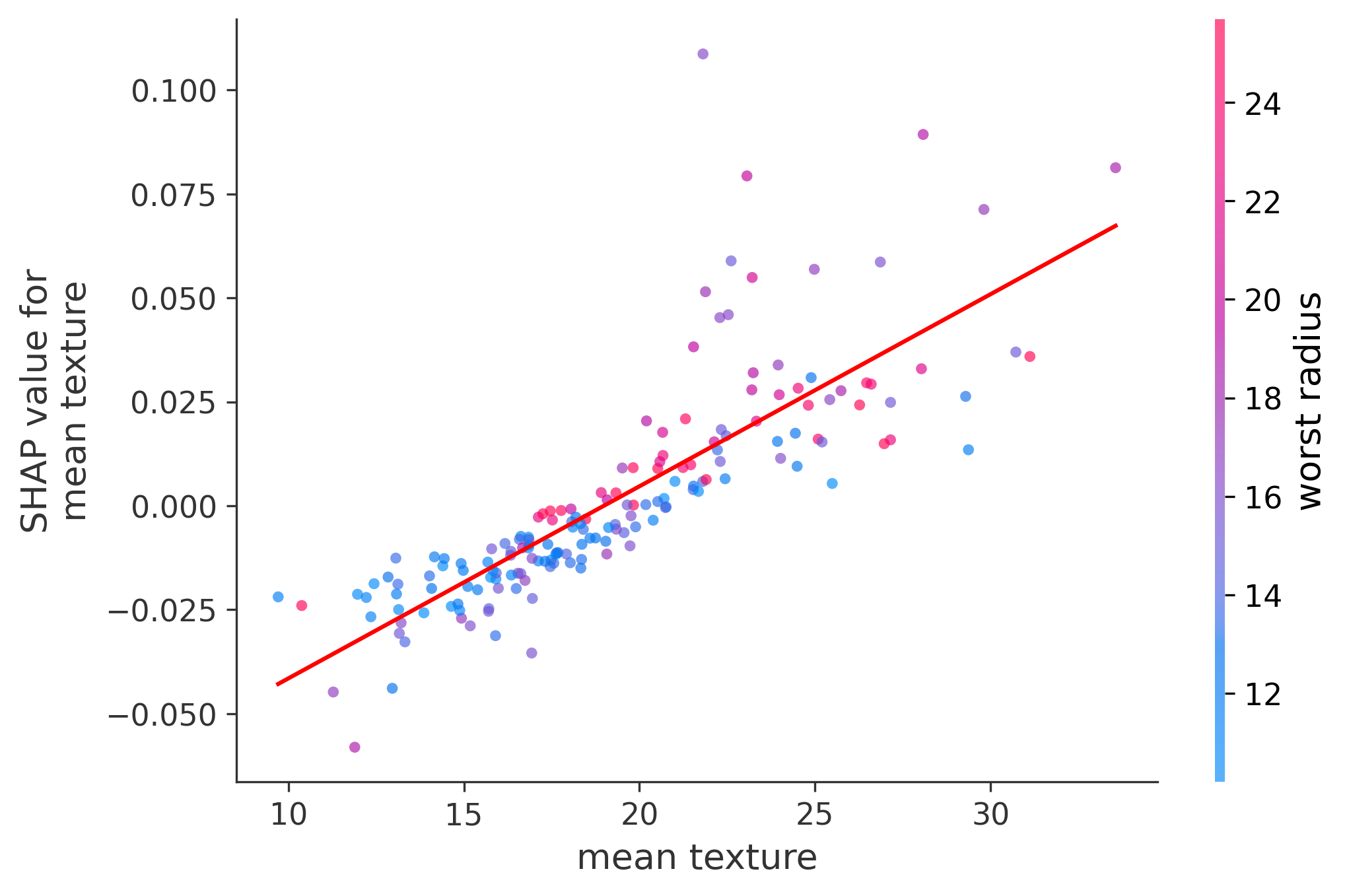
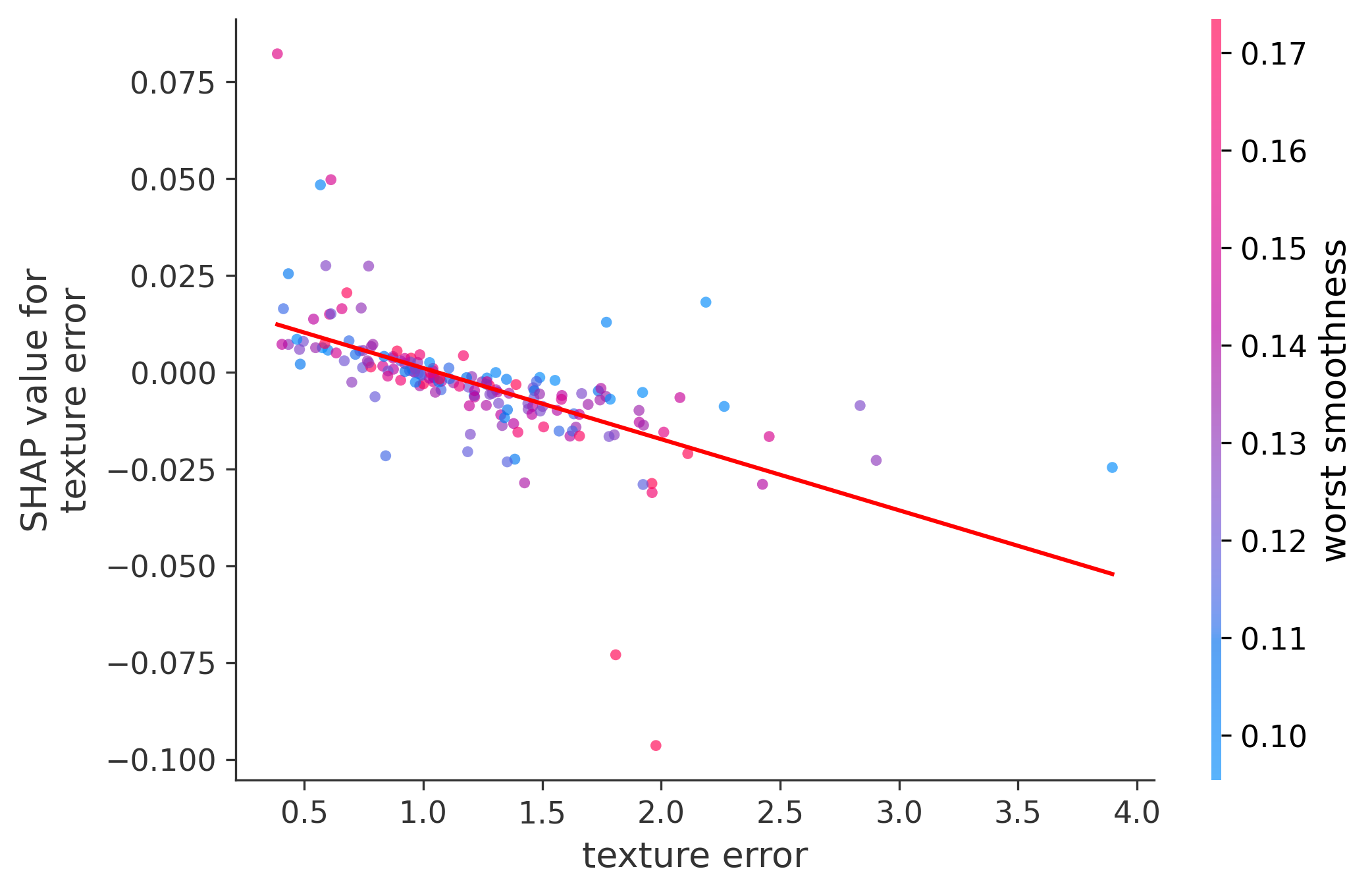
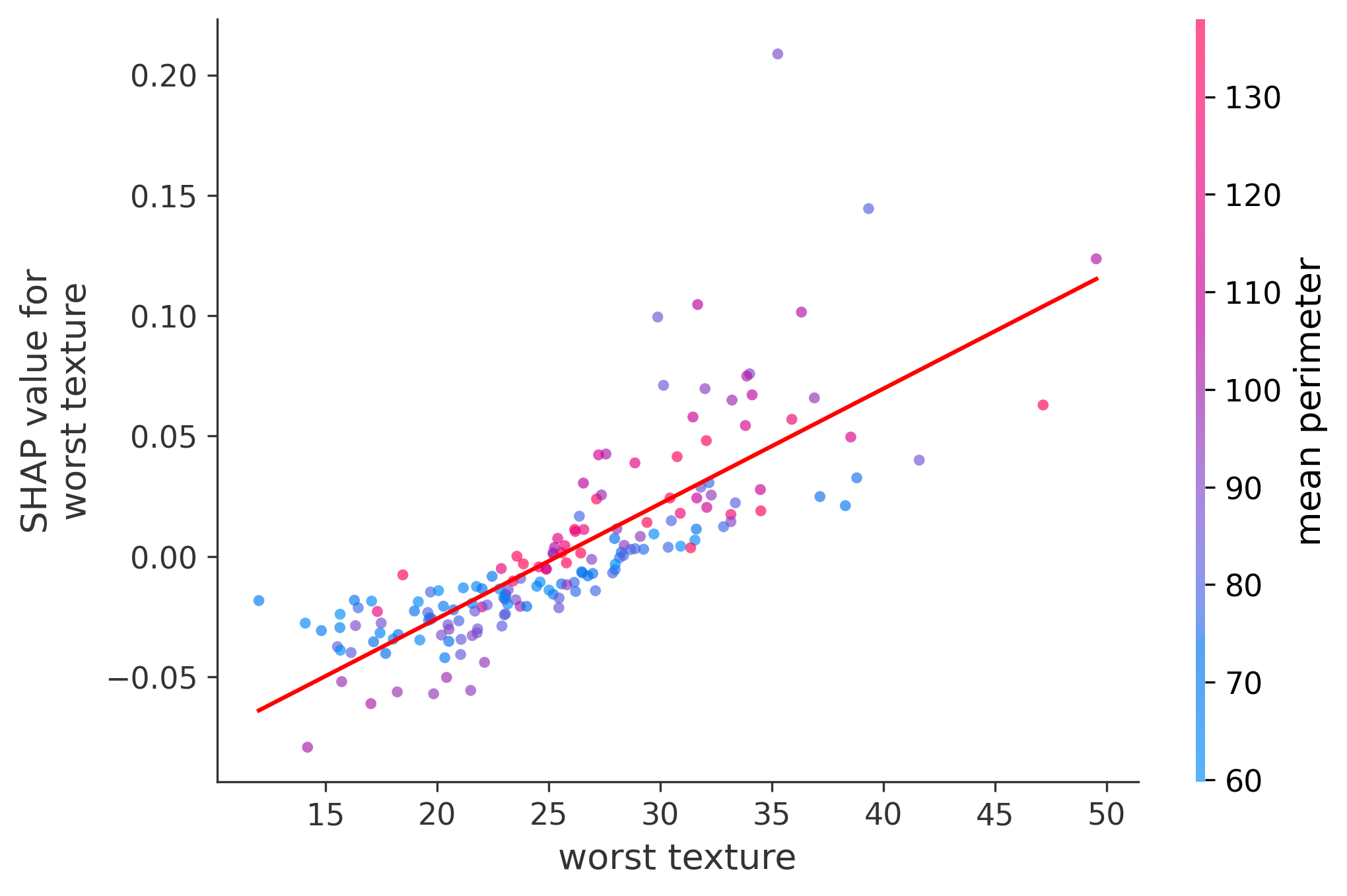
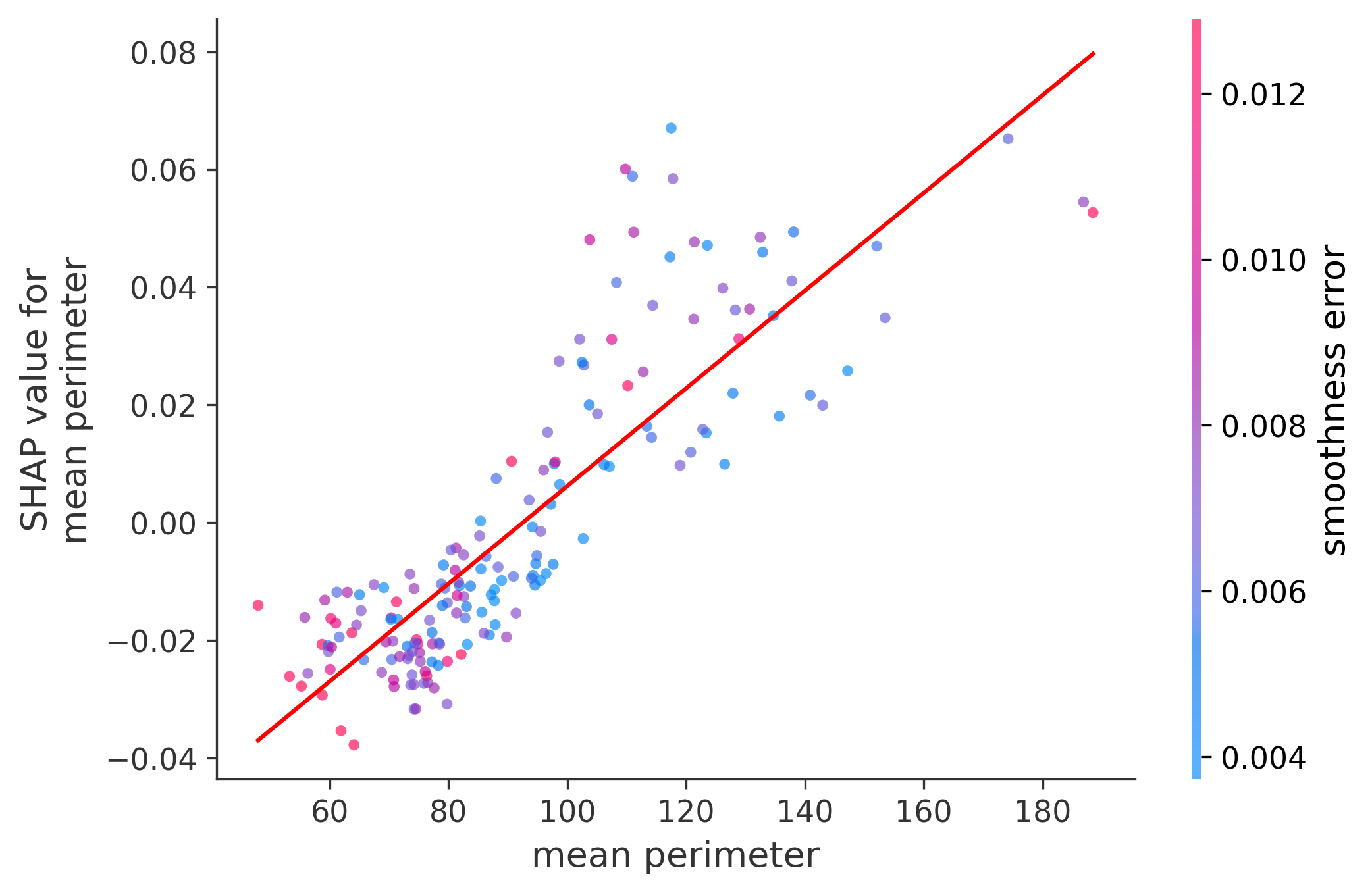
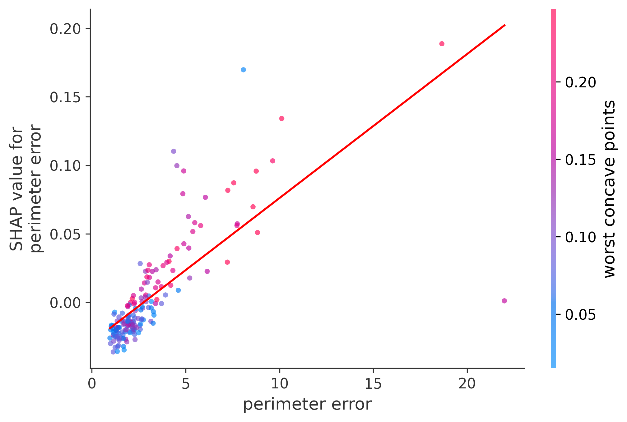
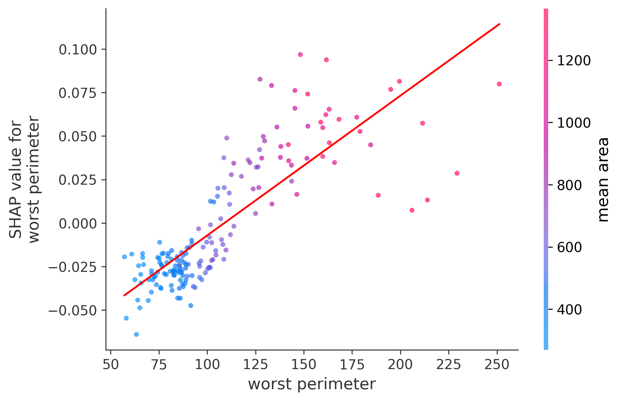
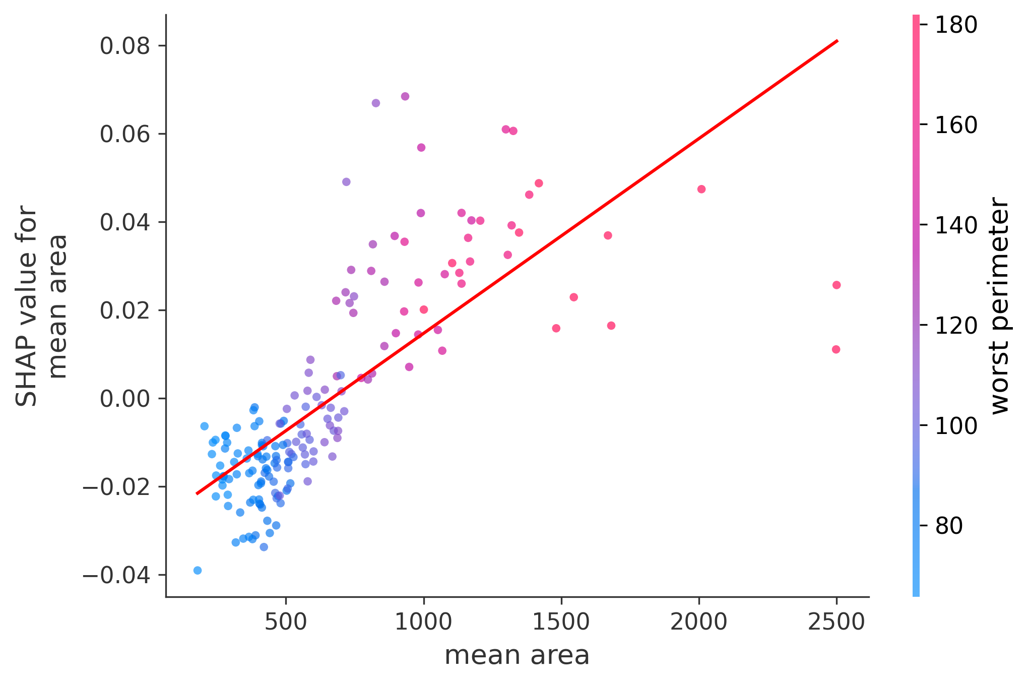
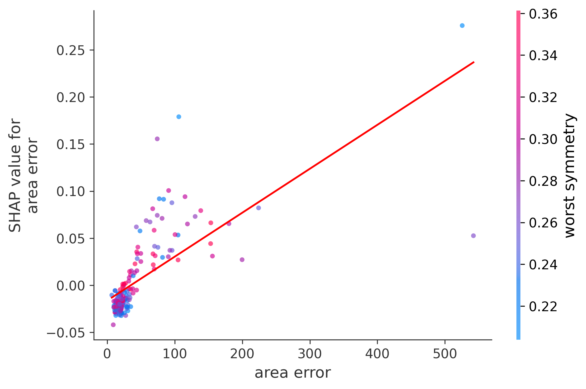
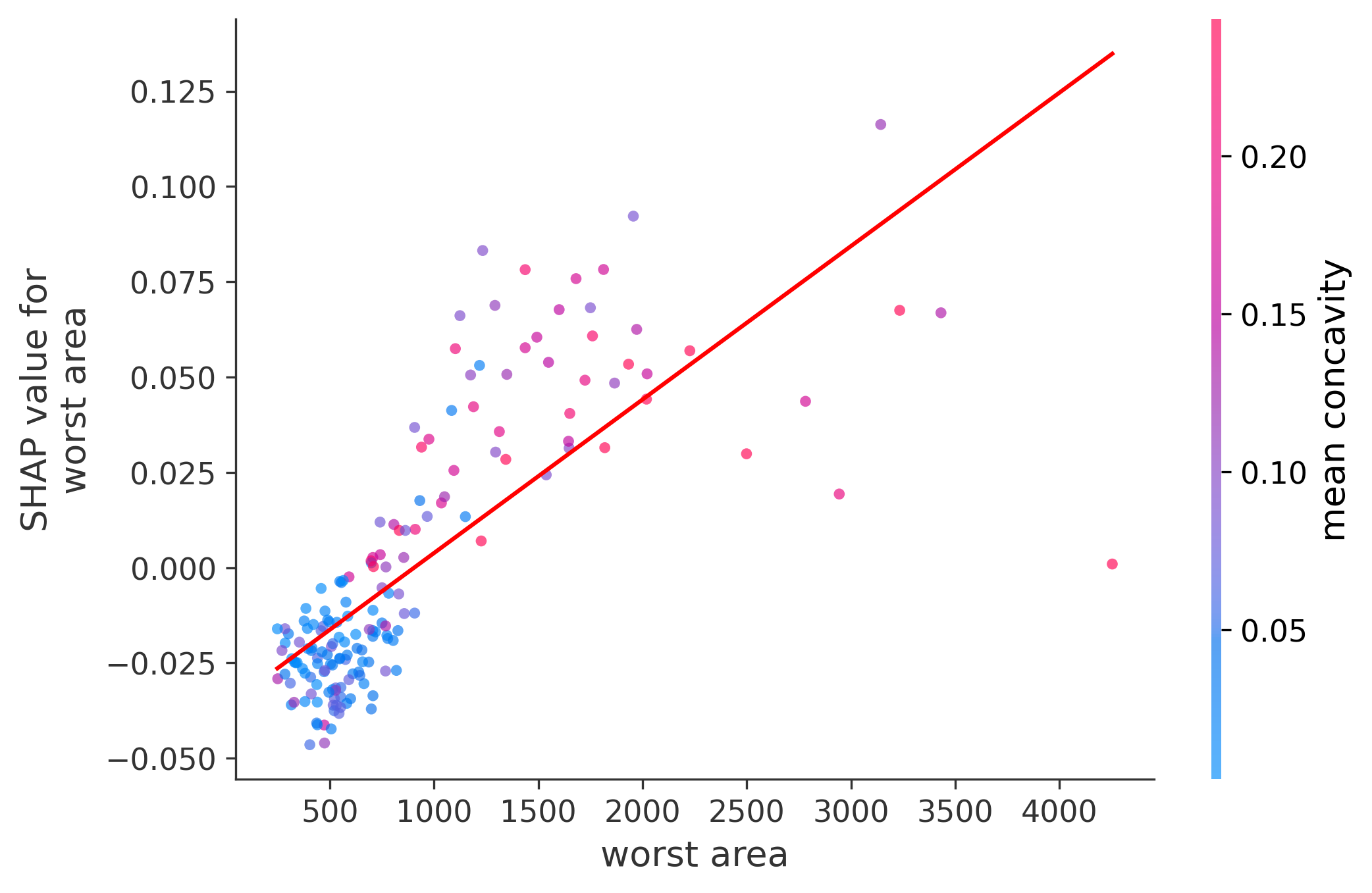
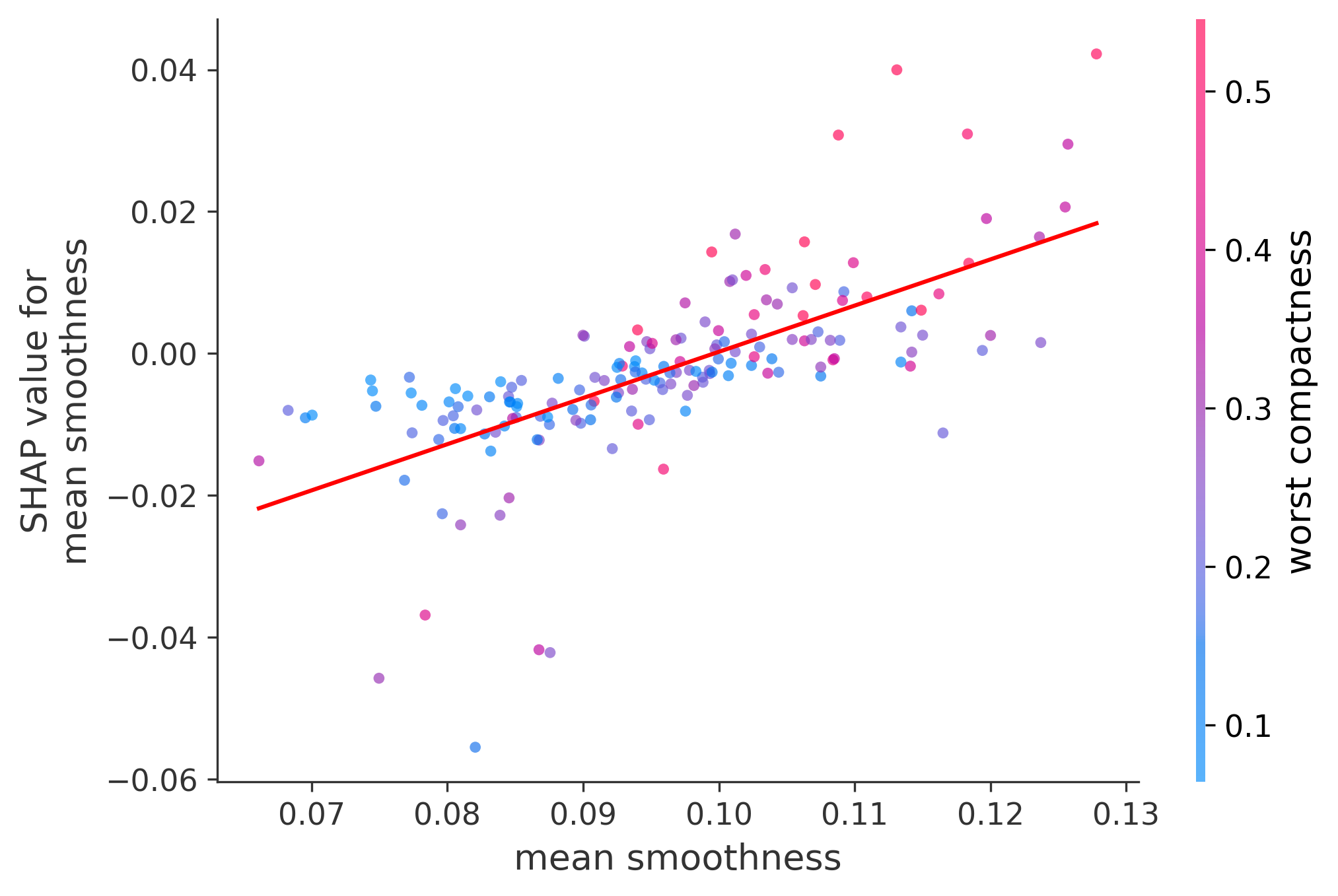
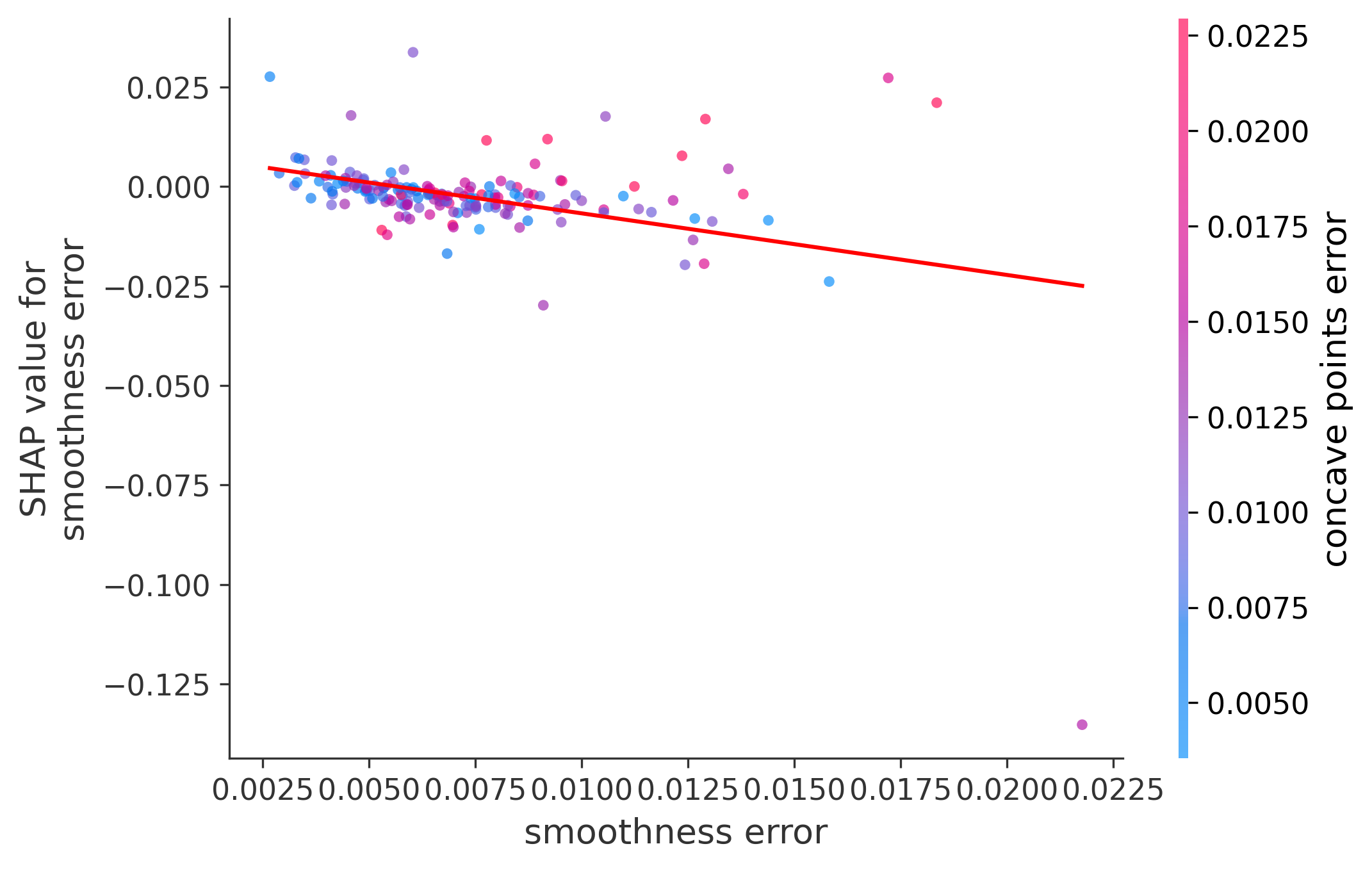
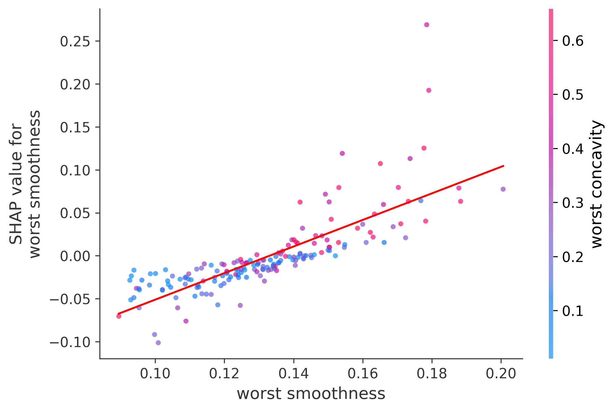
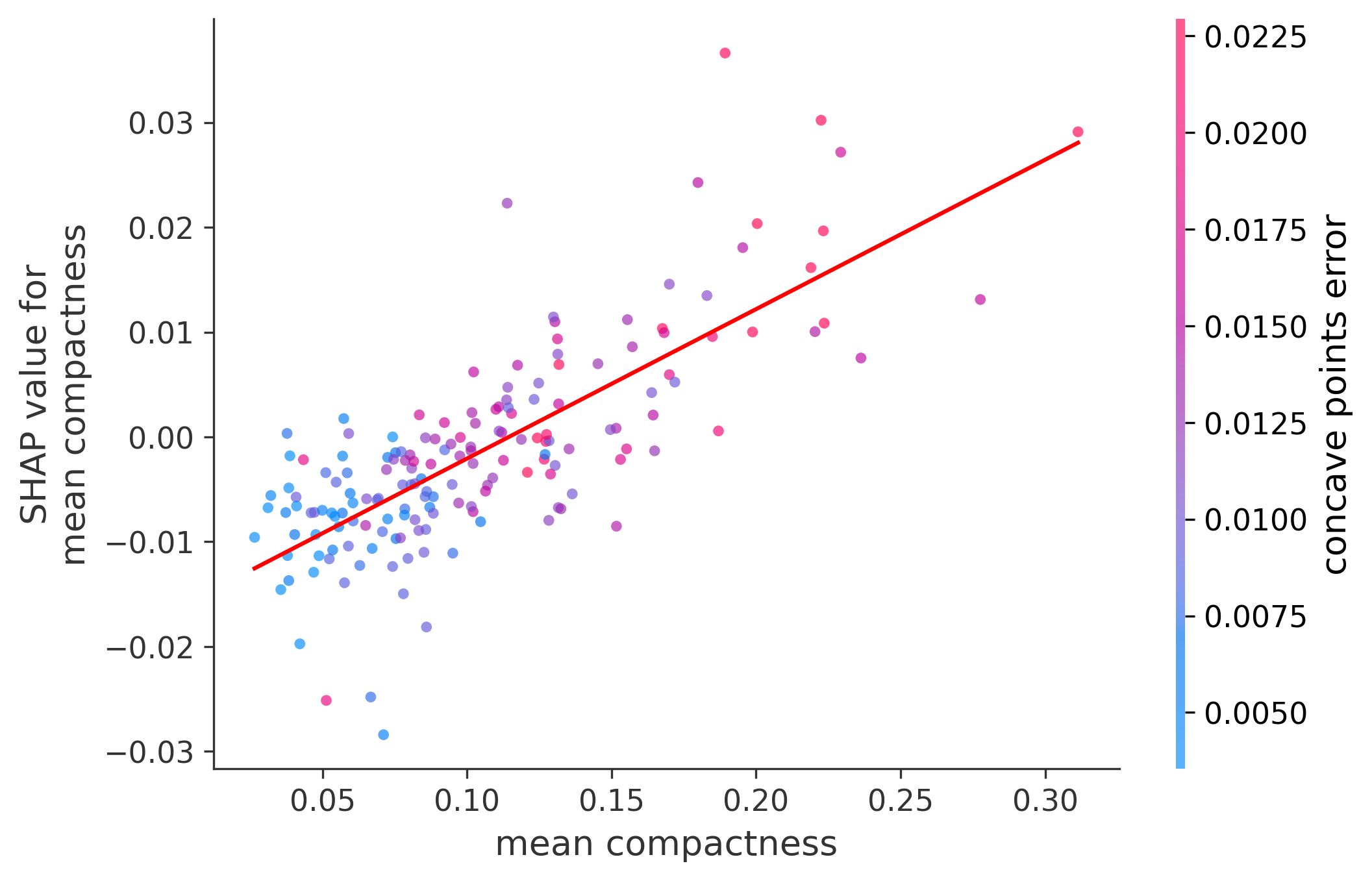
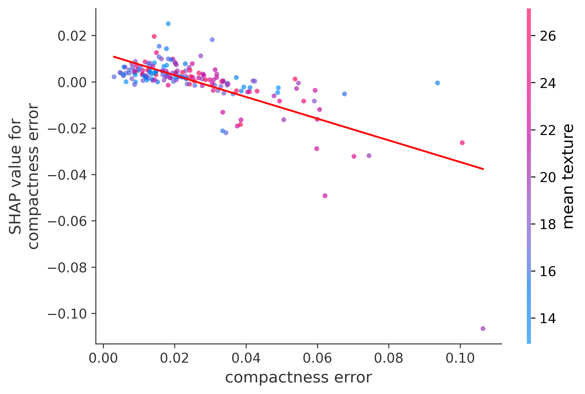
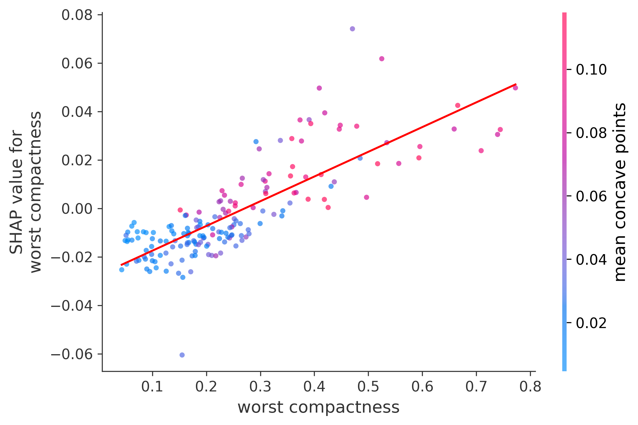
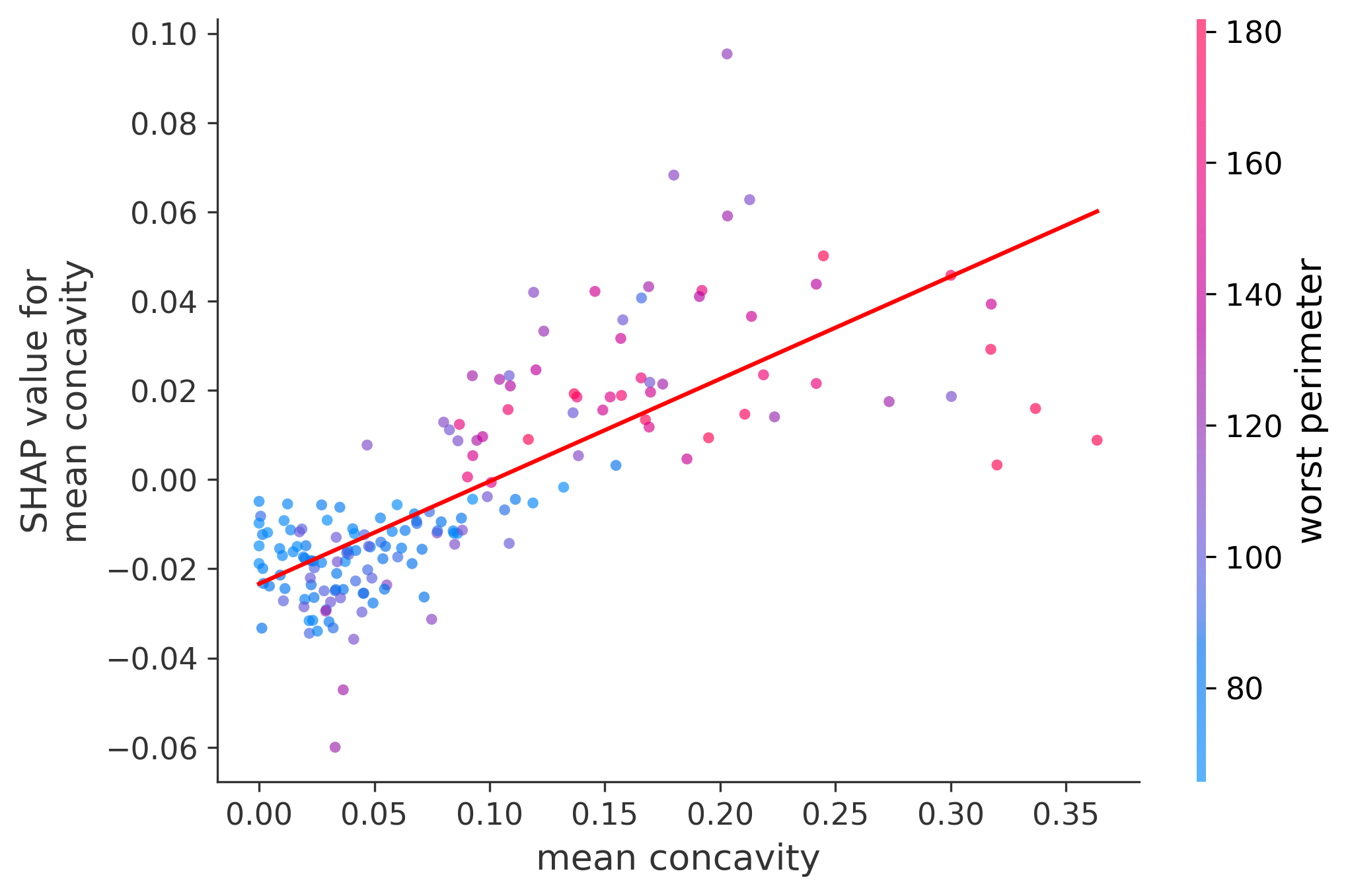
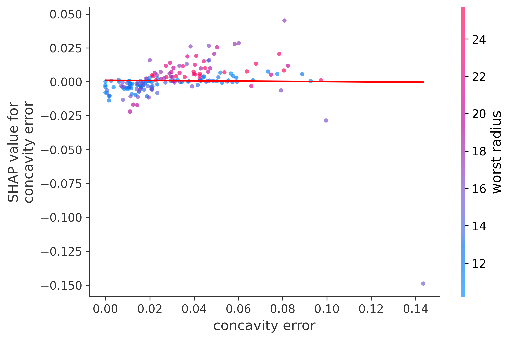
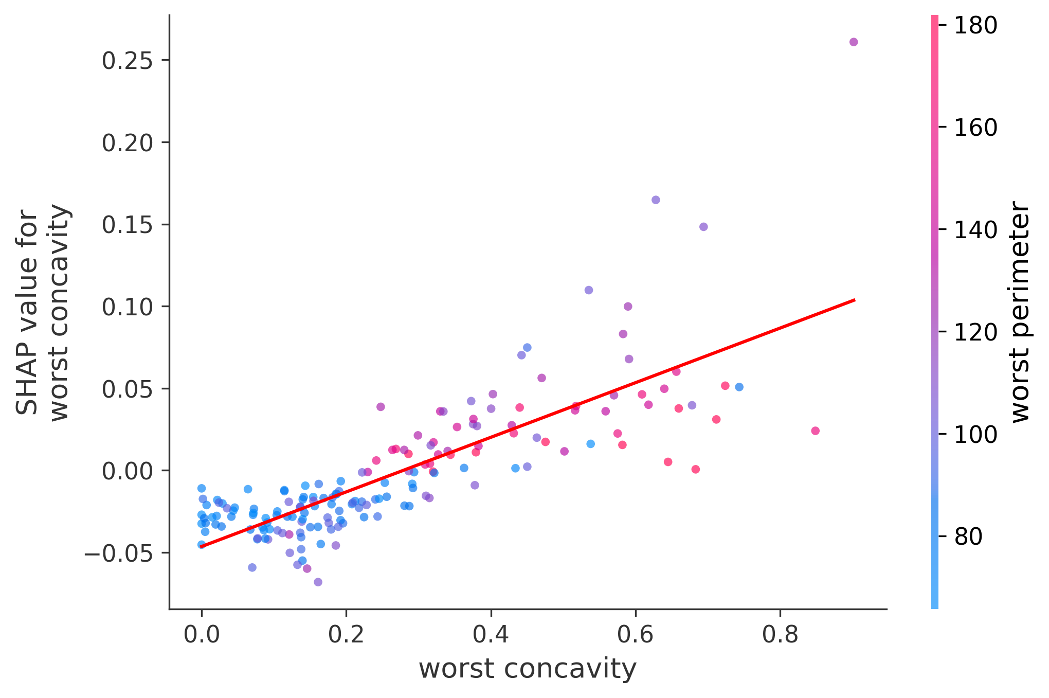
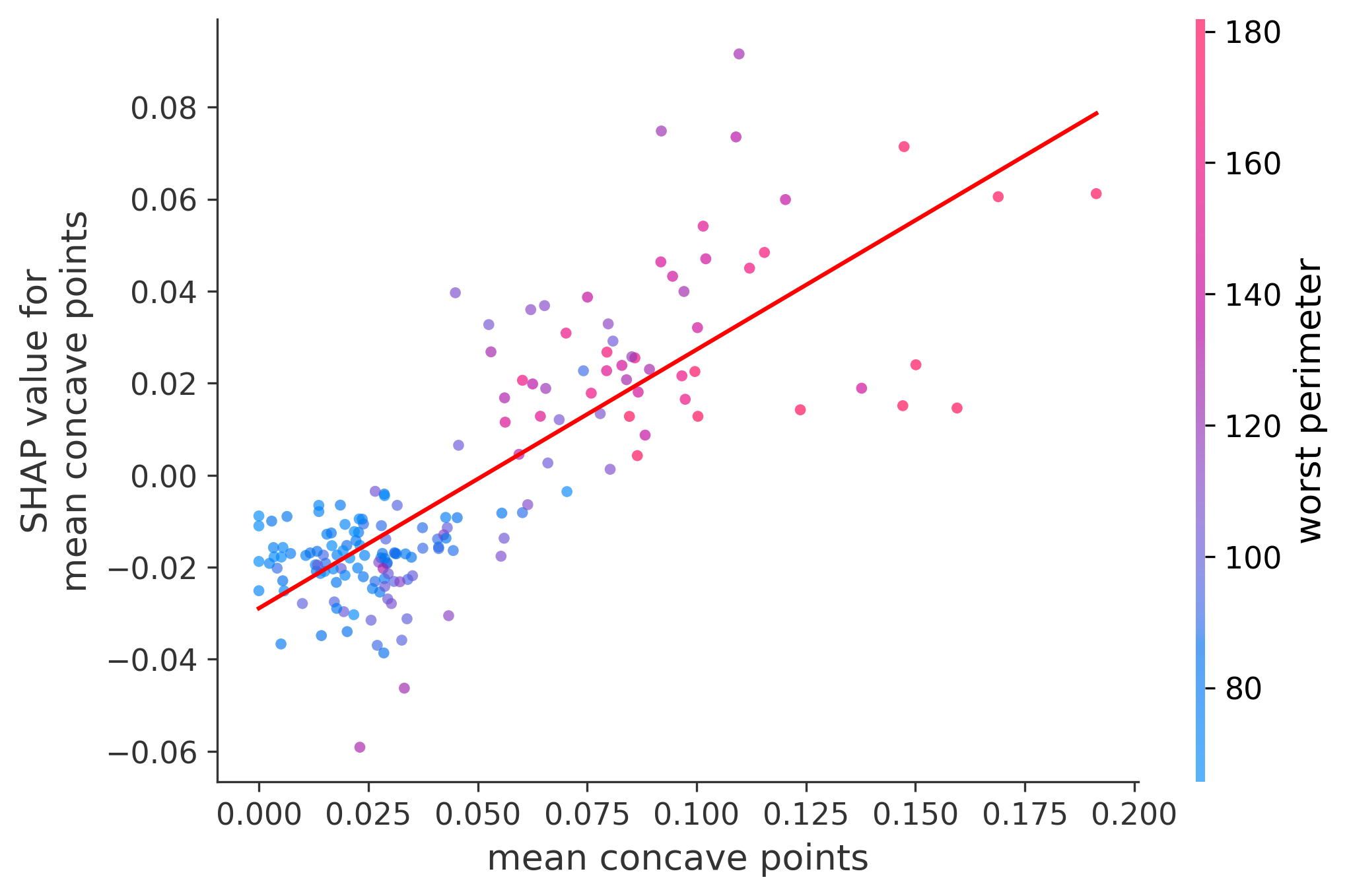
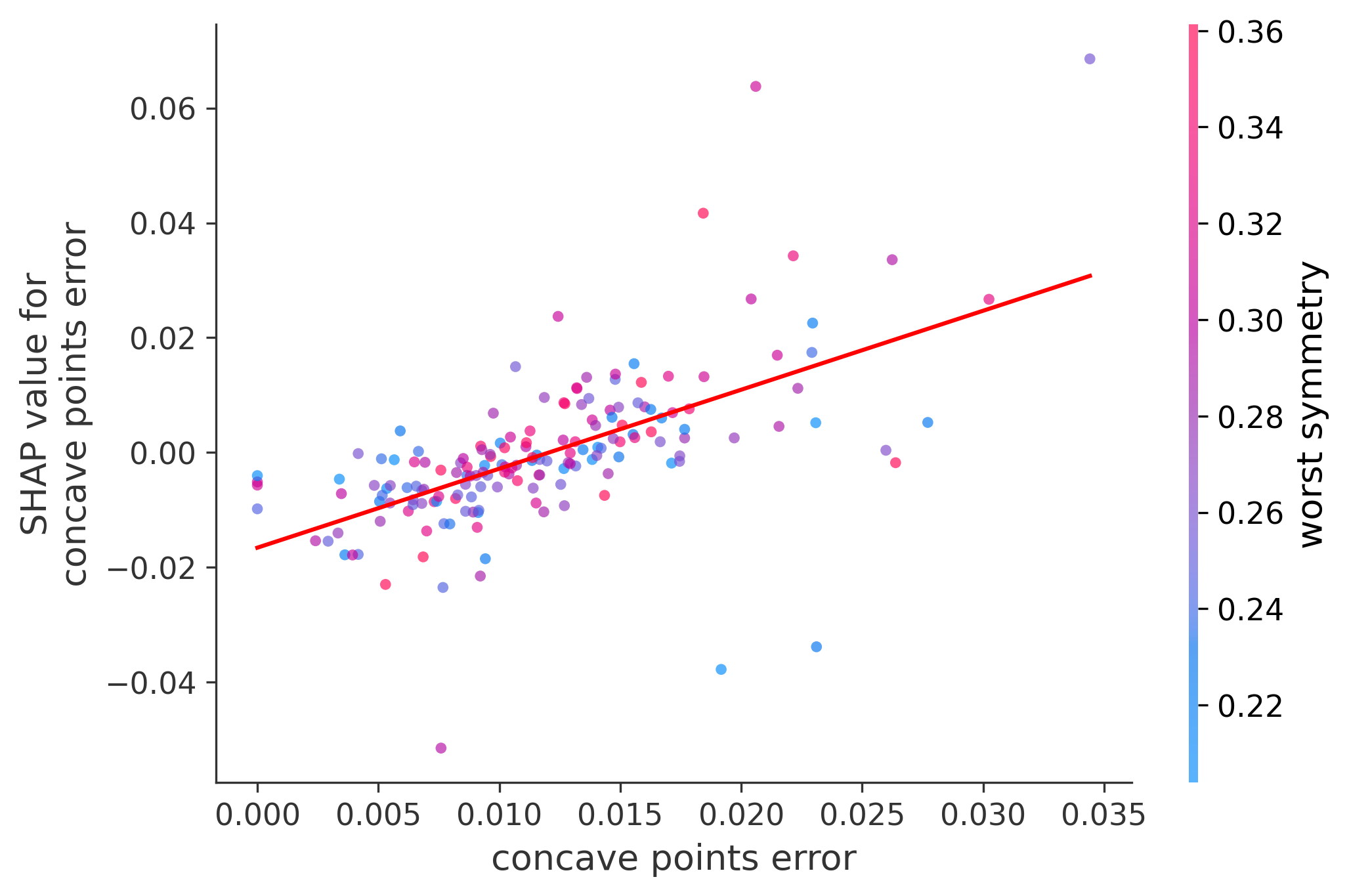
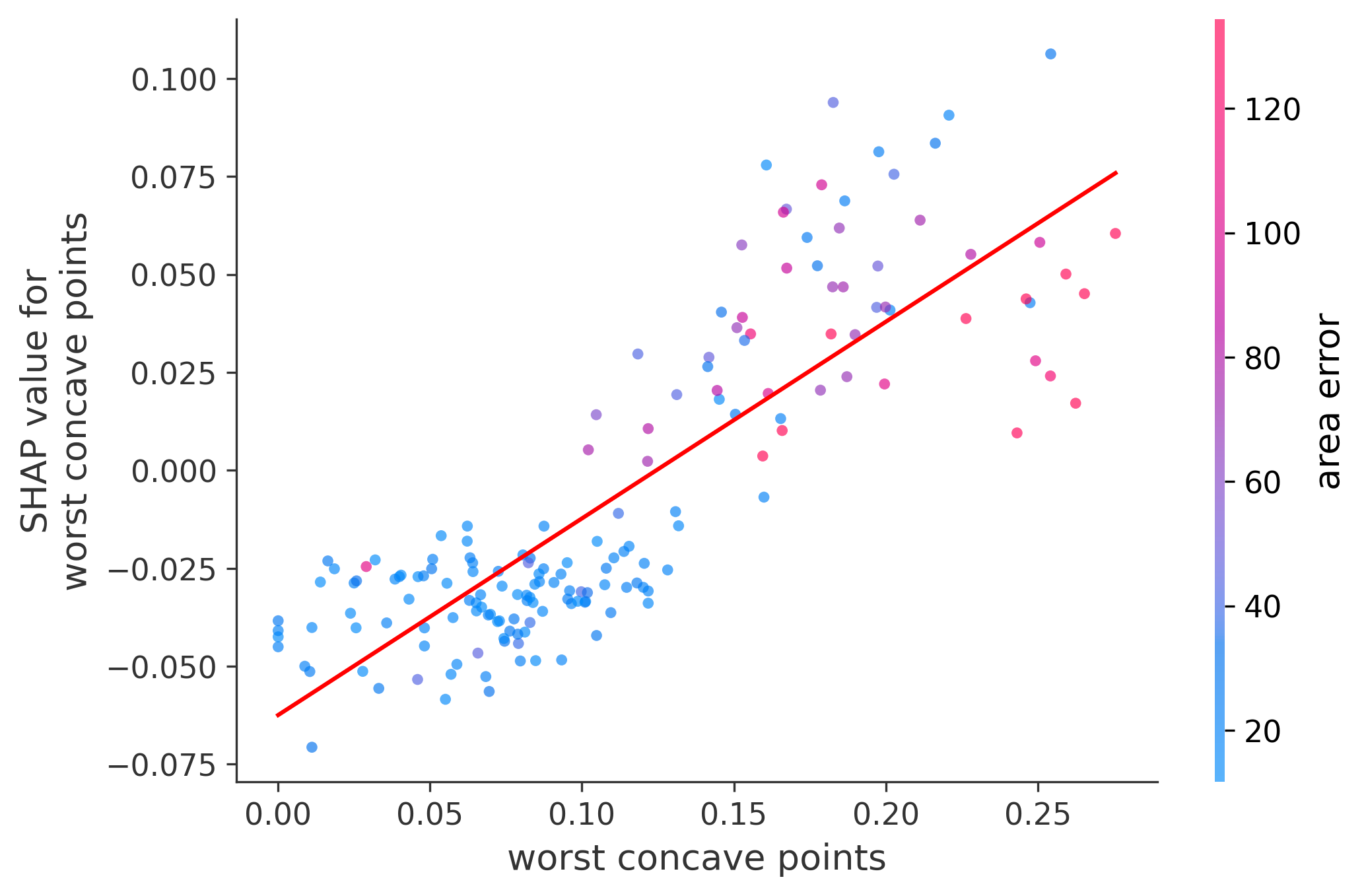
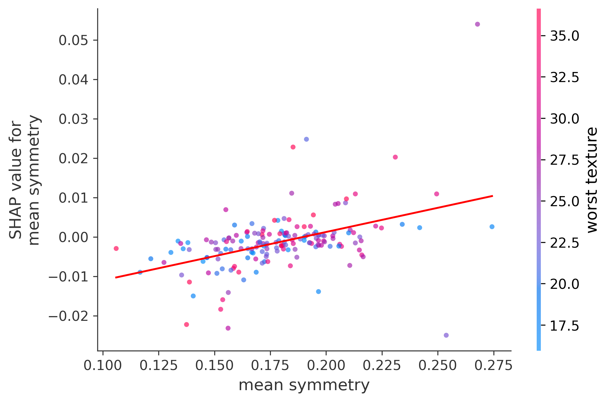
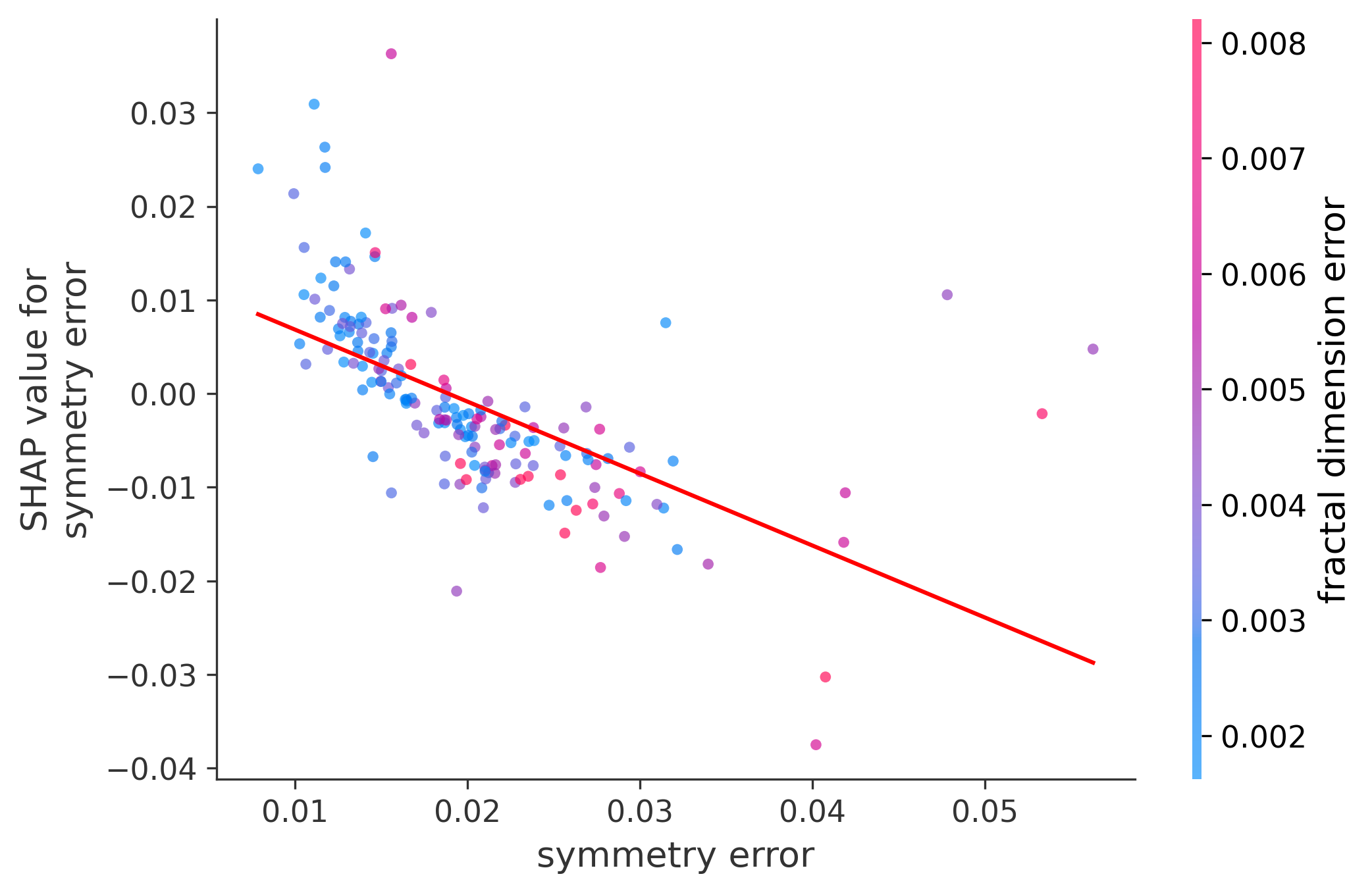
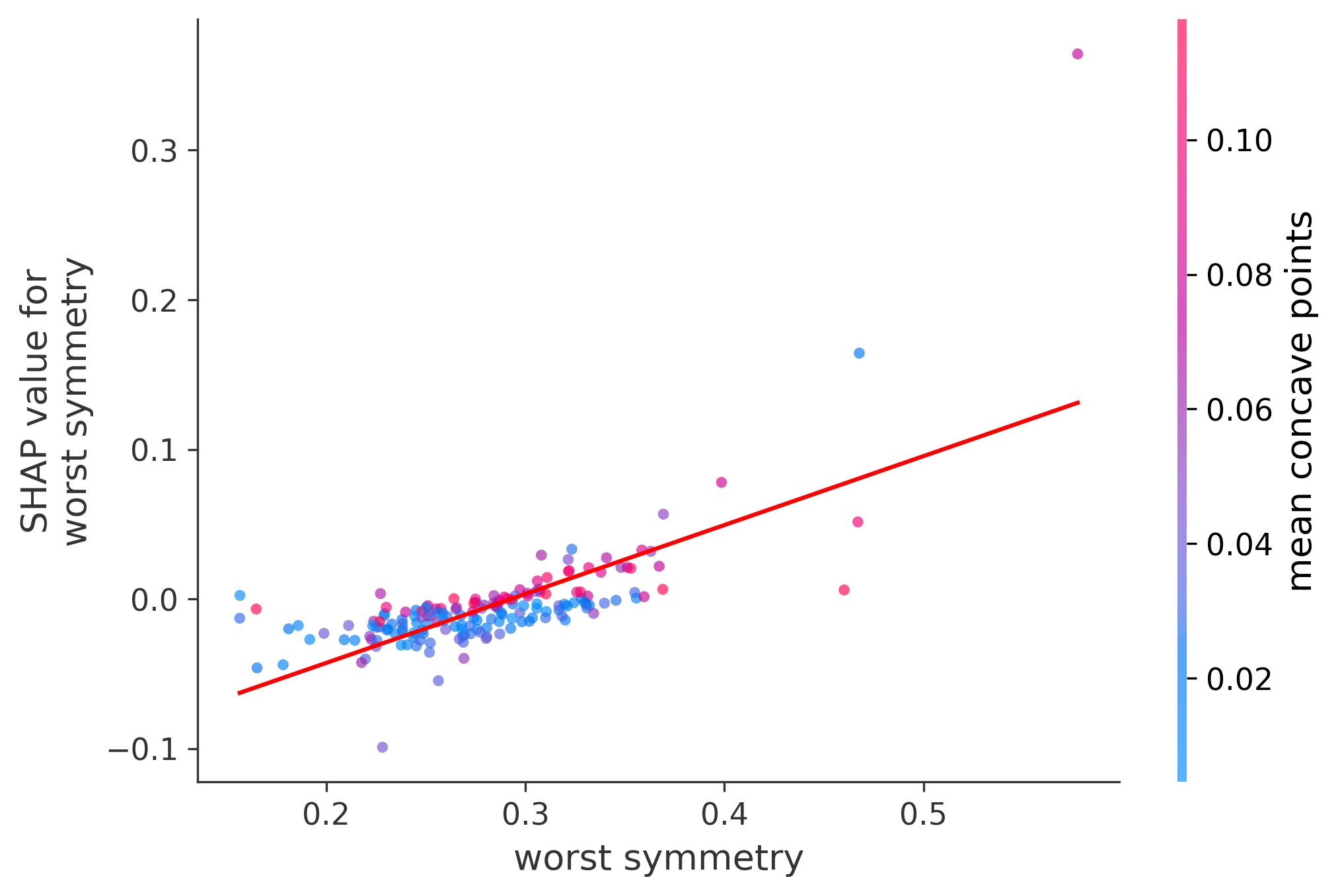
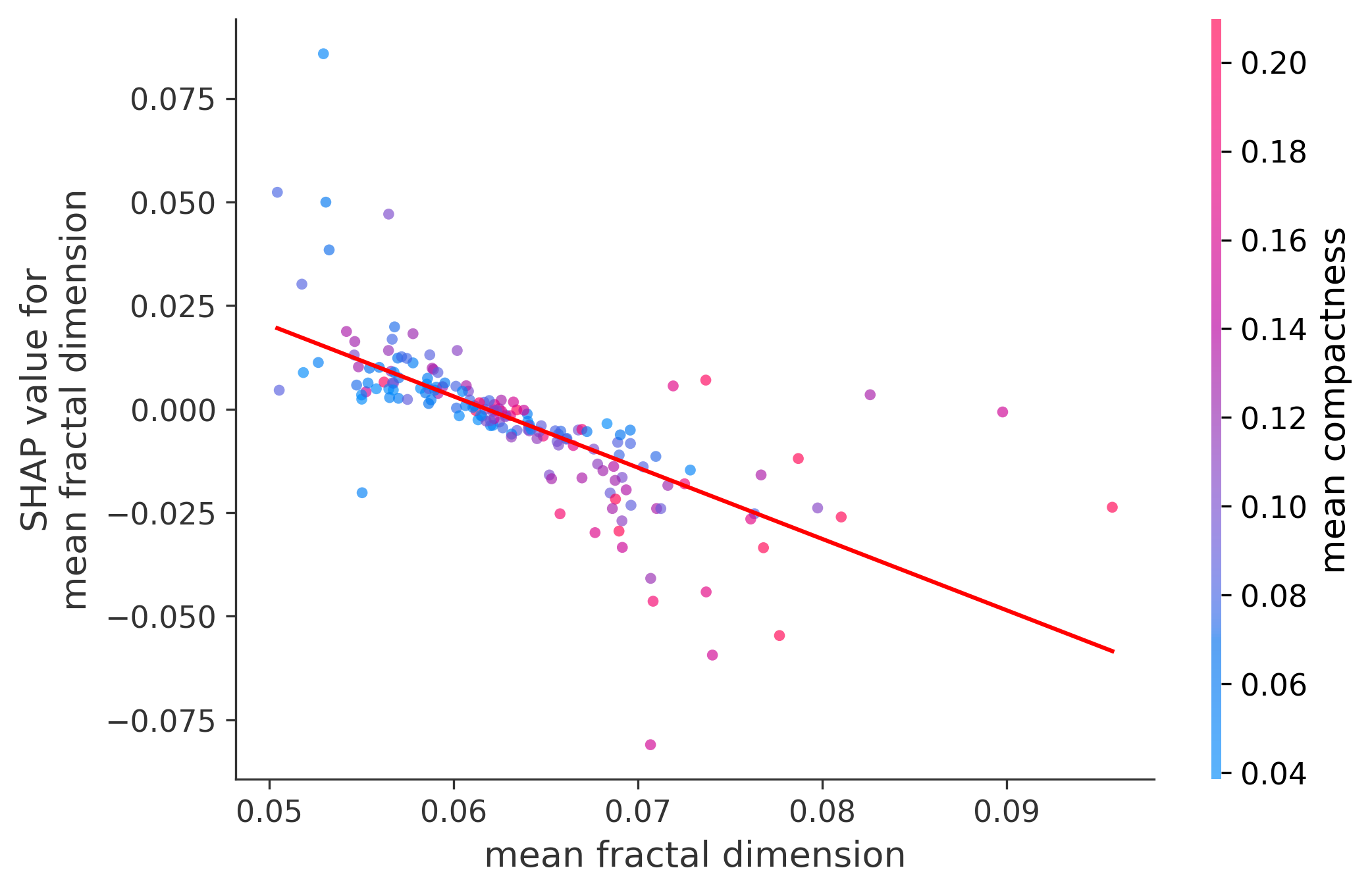
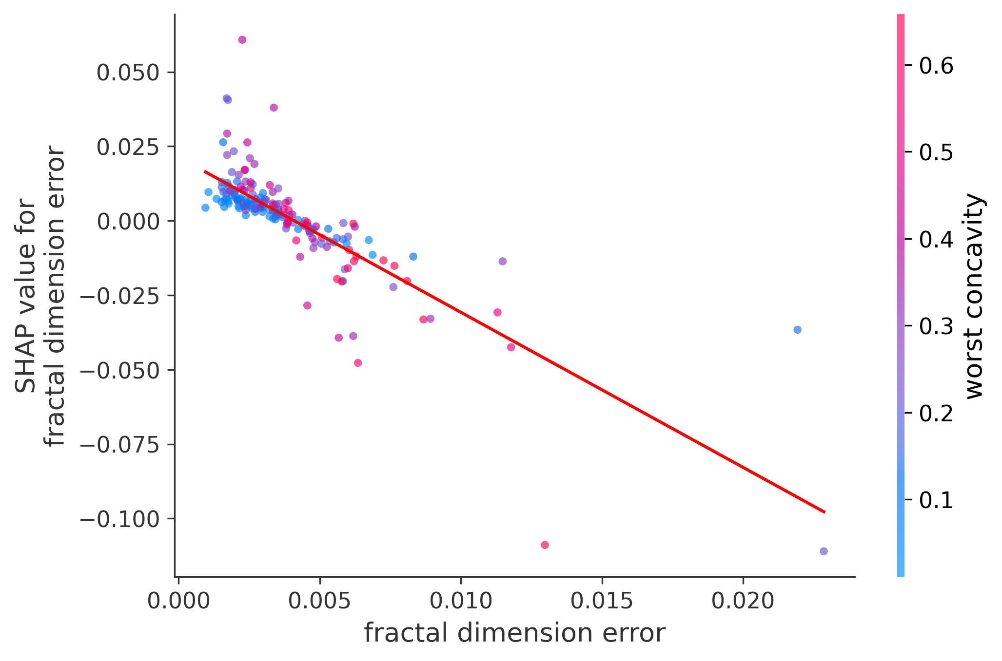
Single Feature Analysis
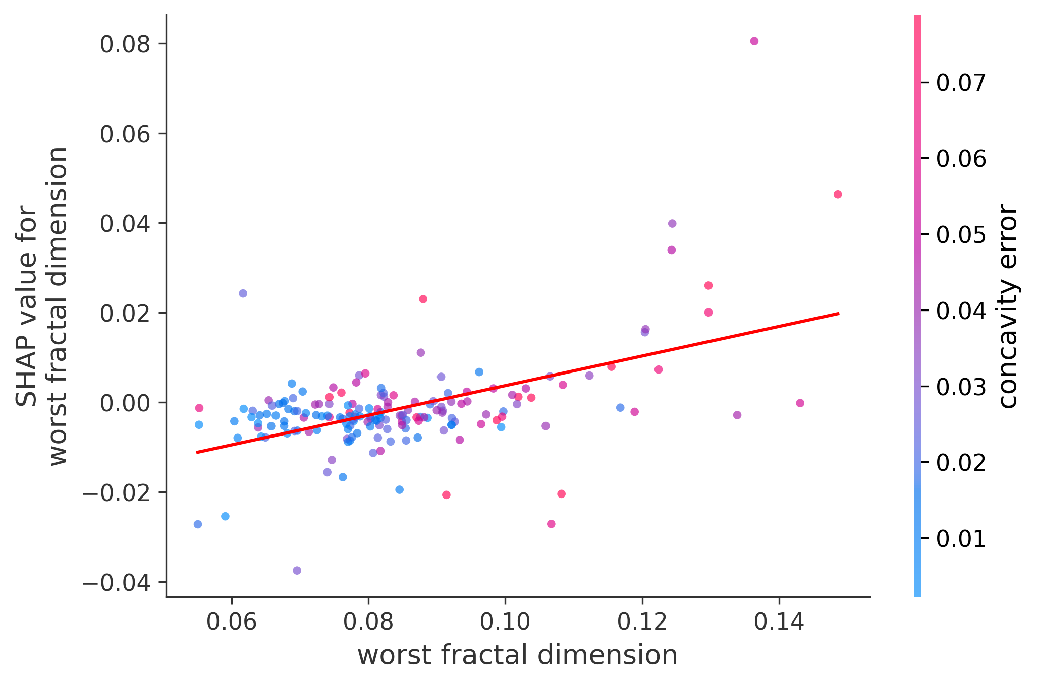
In these plots we can see in more detail how each of the features affects the result, each dot is again a sample, with dots to the right being higher values of that feature, and dots to the left being lower values of that feature, the Y axis is the predicted probability of the sample being malignant, the more to the top the more malignant the sample was, and the more to the bottom the more benign it was. The red line helps us see the trend of the feature, if the line is going up, it means that the feature is positively correlated with the result, that is, the higher the value, the more likely the sample is to be malignant, and if the line is going down, it means that the feature is negatively correlated with the result. Lastly the color of the dots are related to another feature which is selected by the SHAP library, the more pink the higher that feature, the more blue the lower that feature.
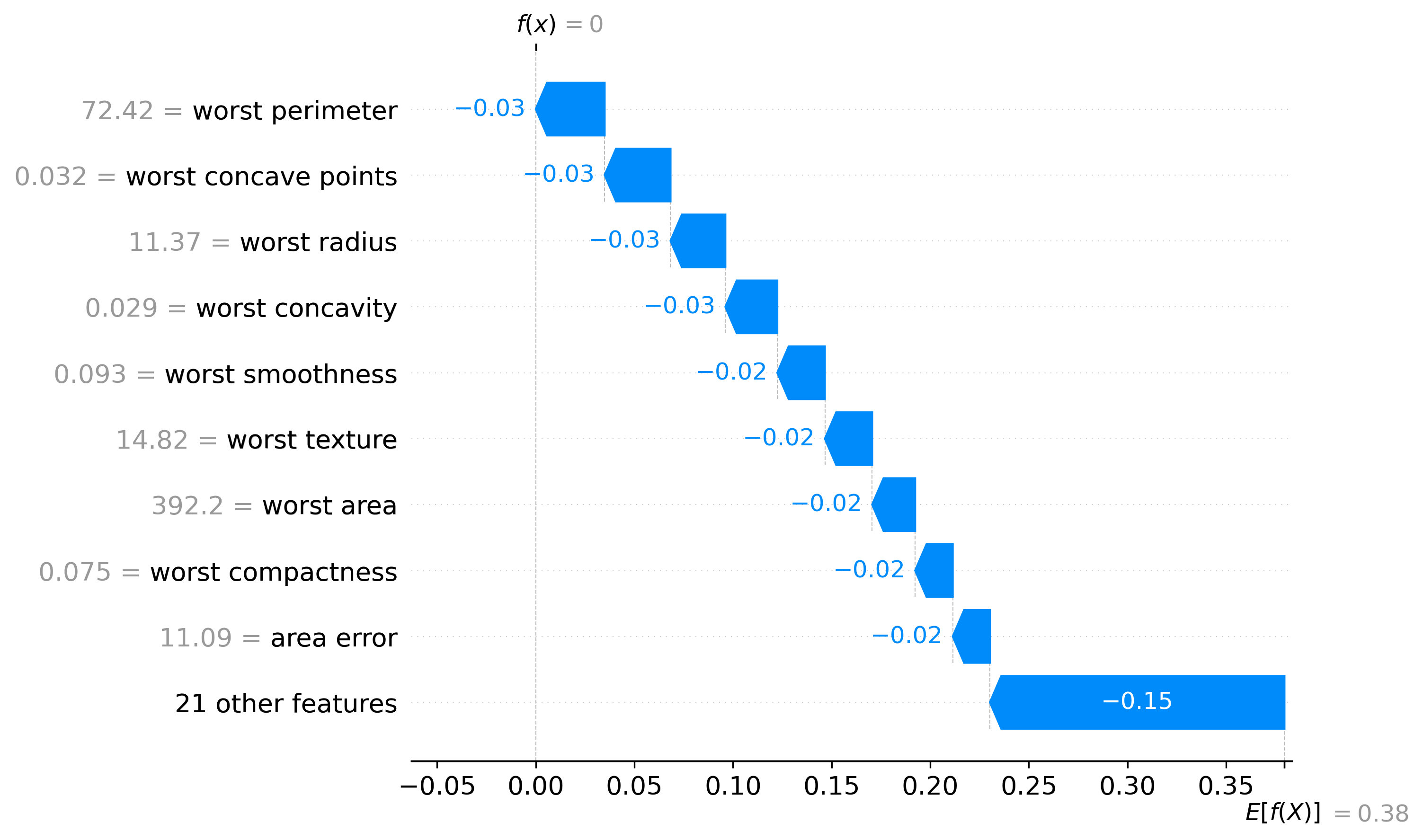
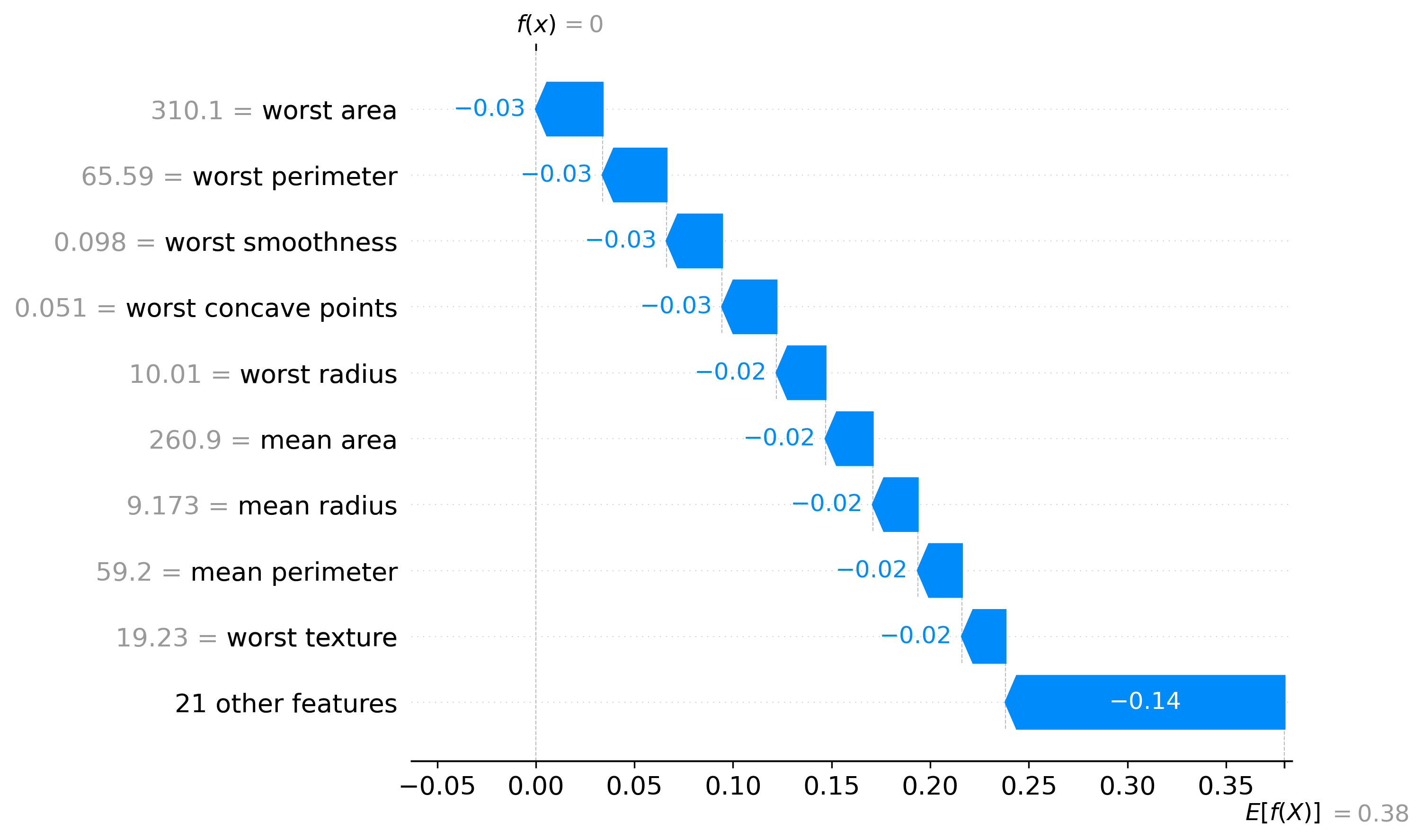
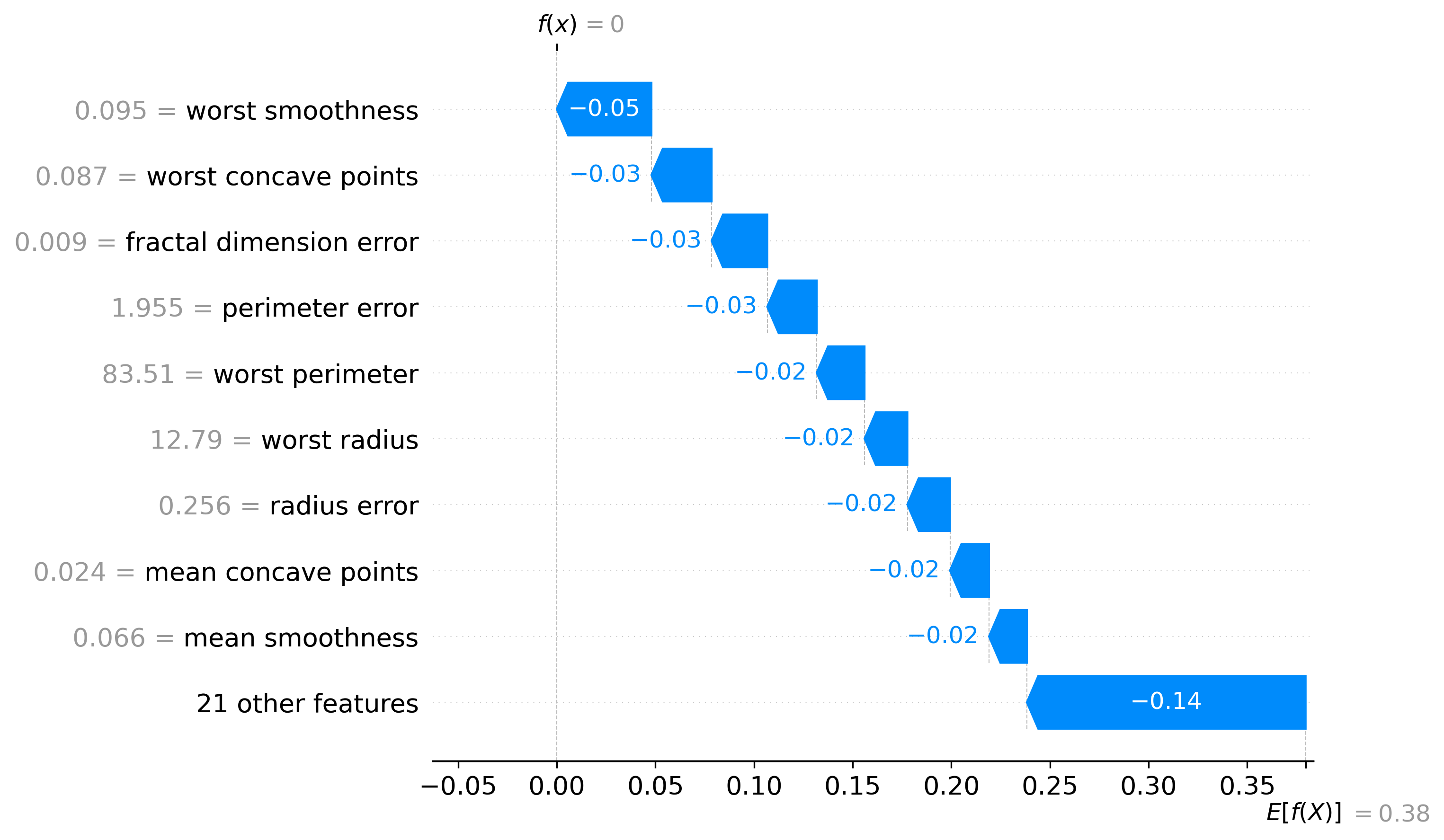
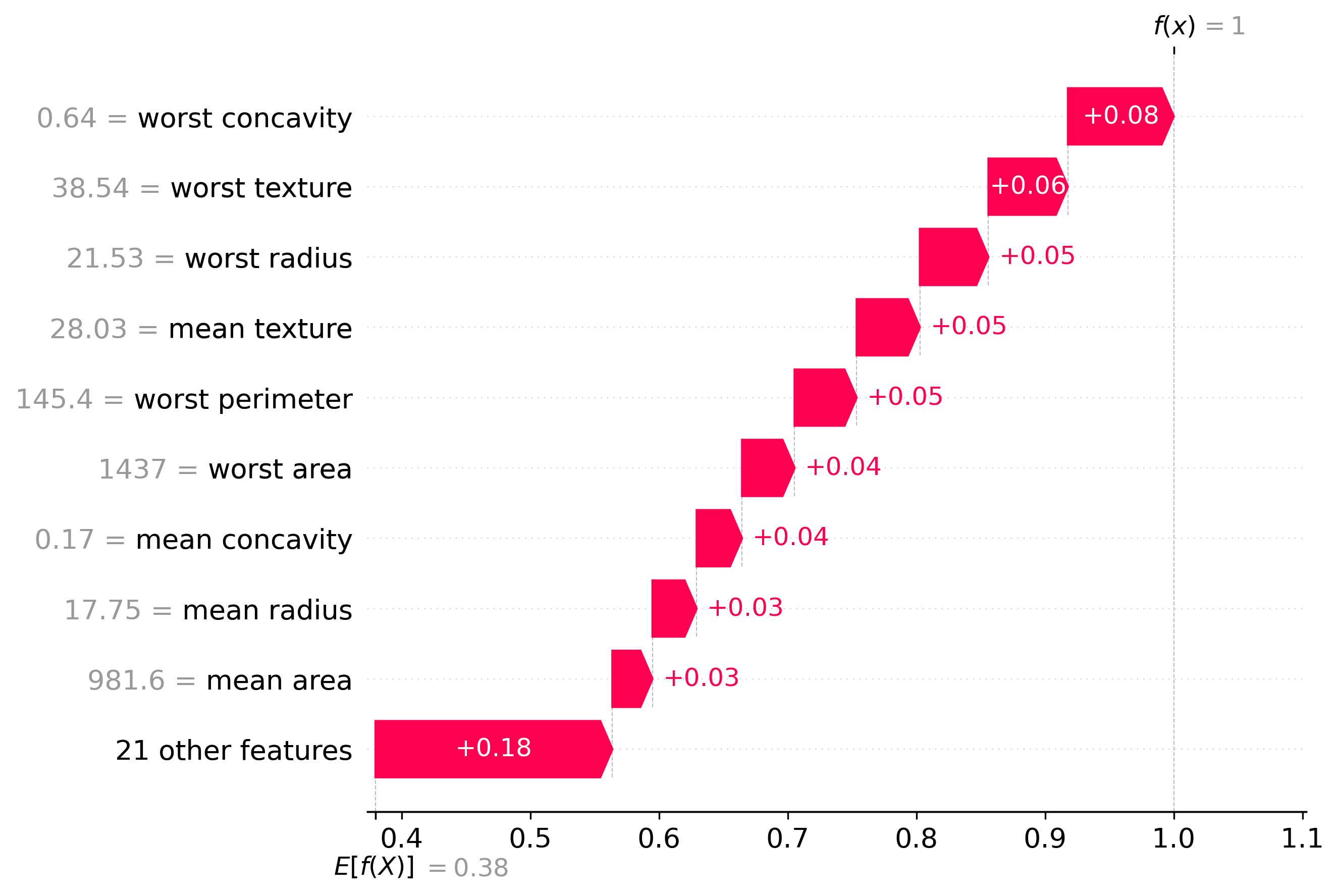
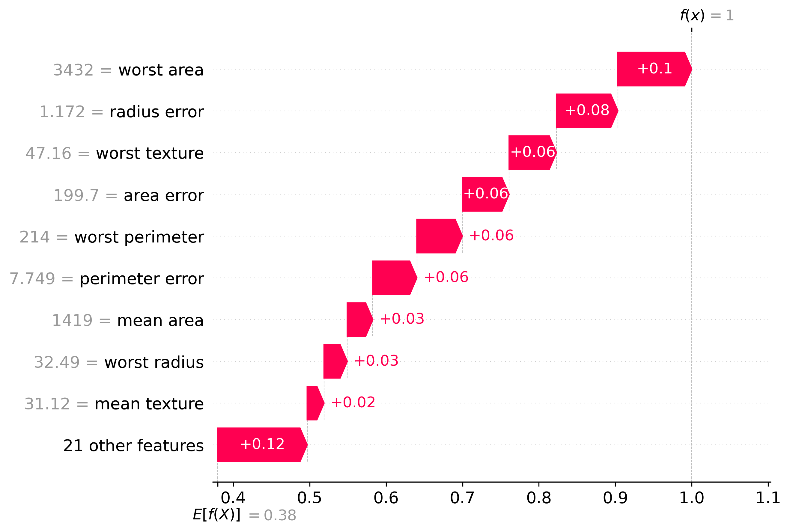
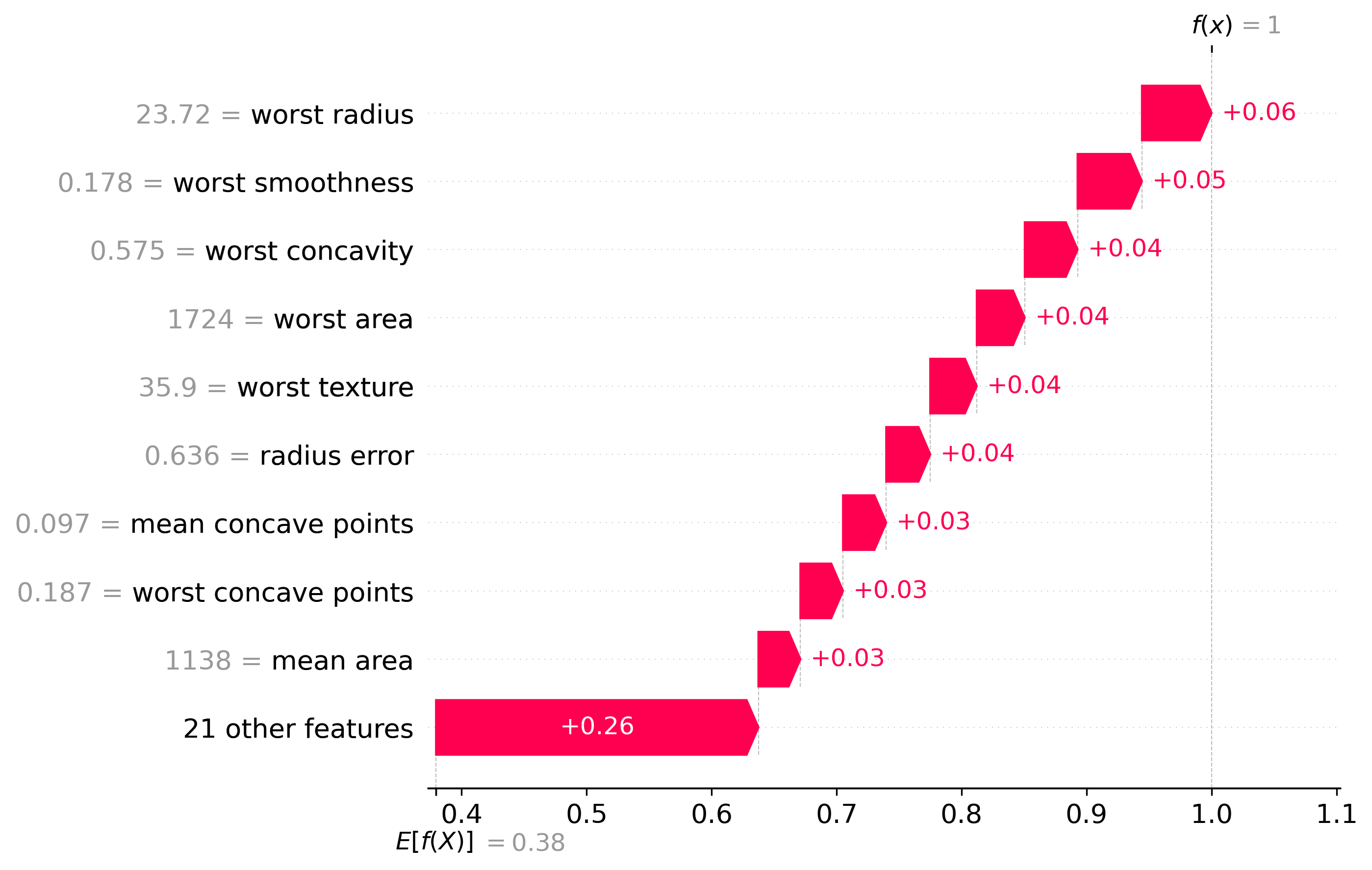
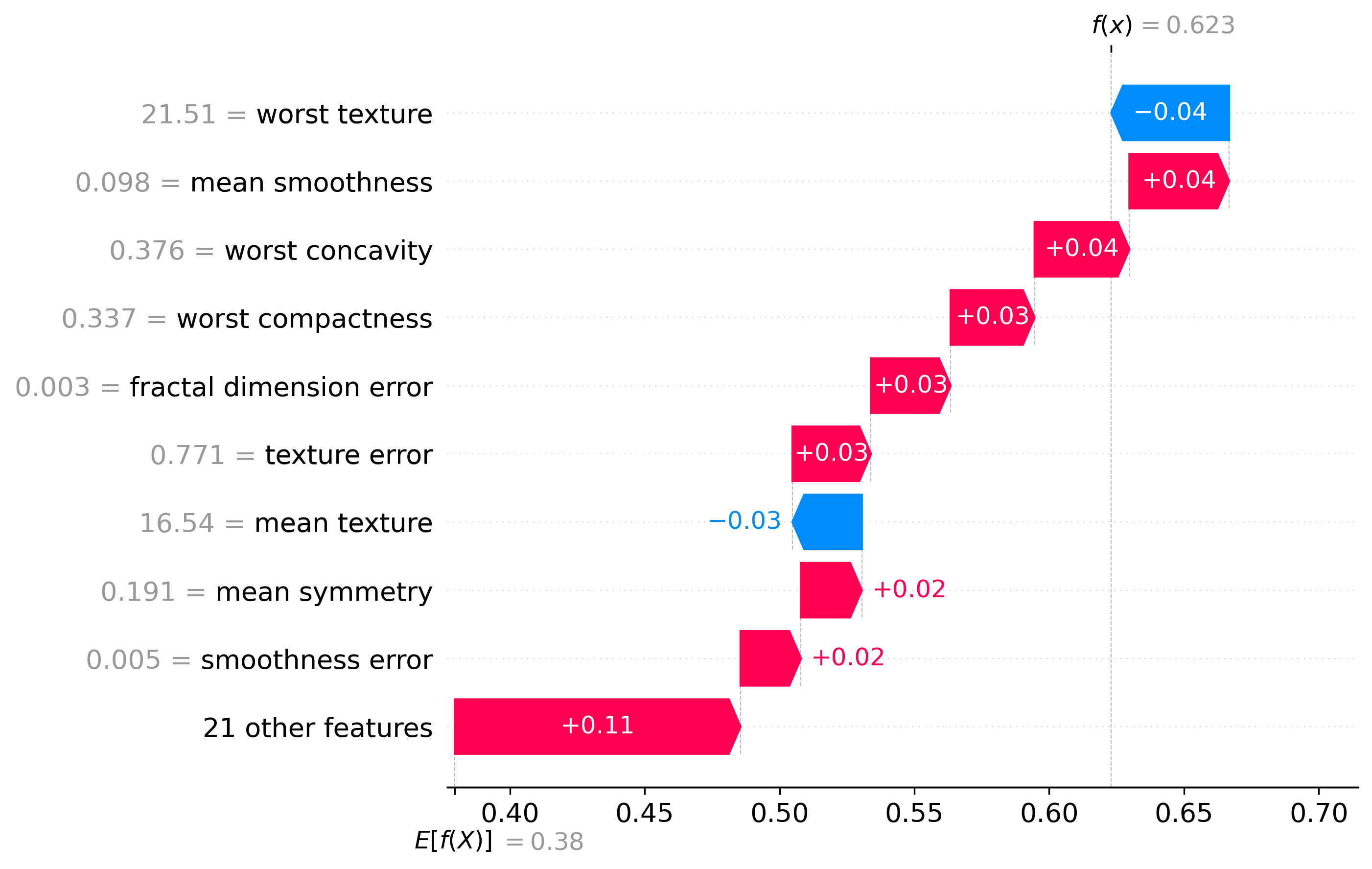
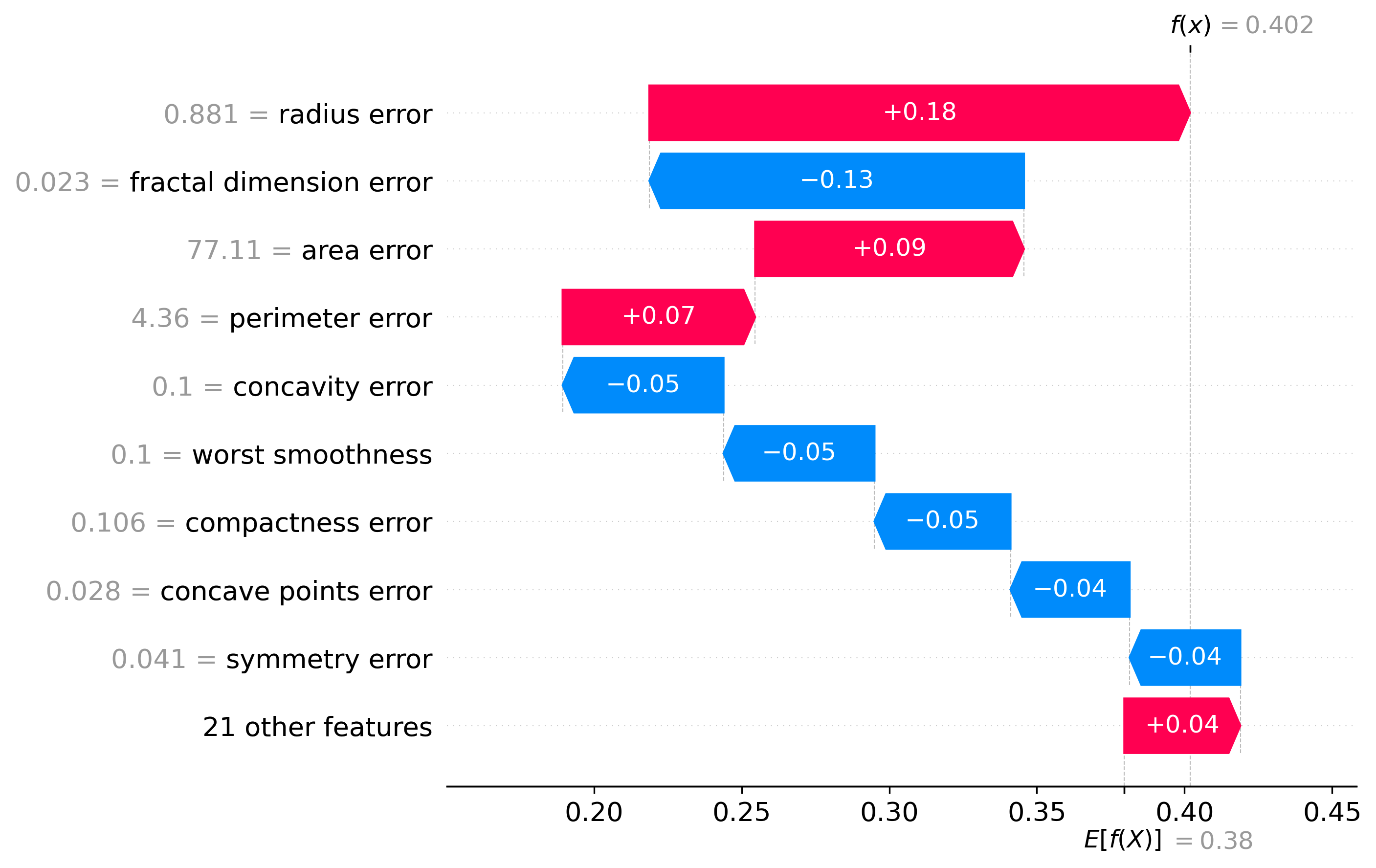
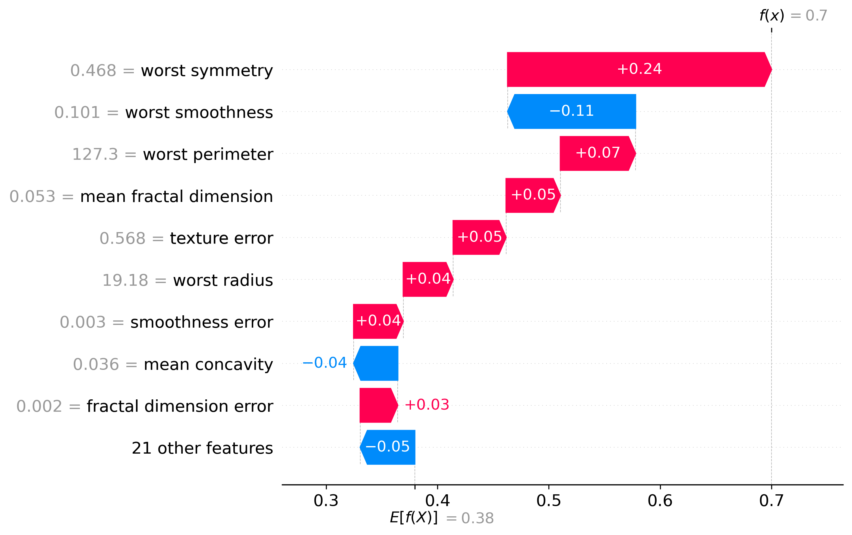
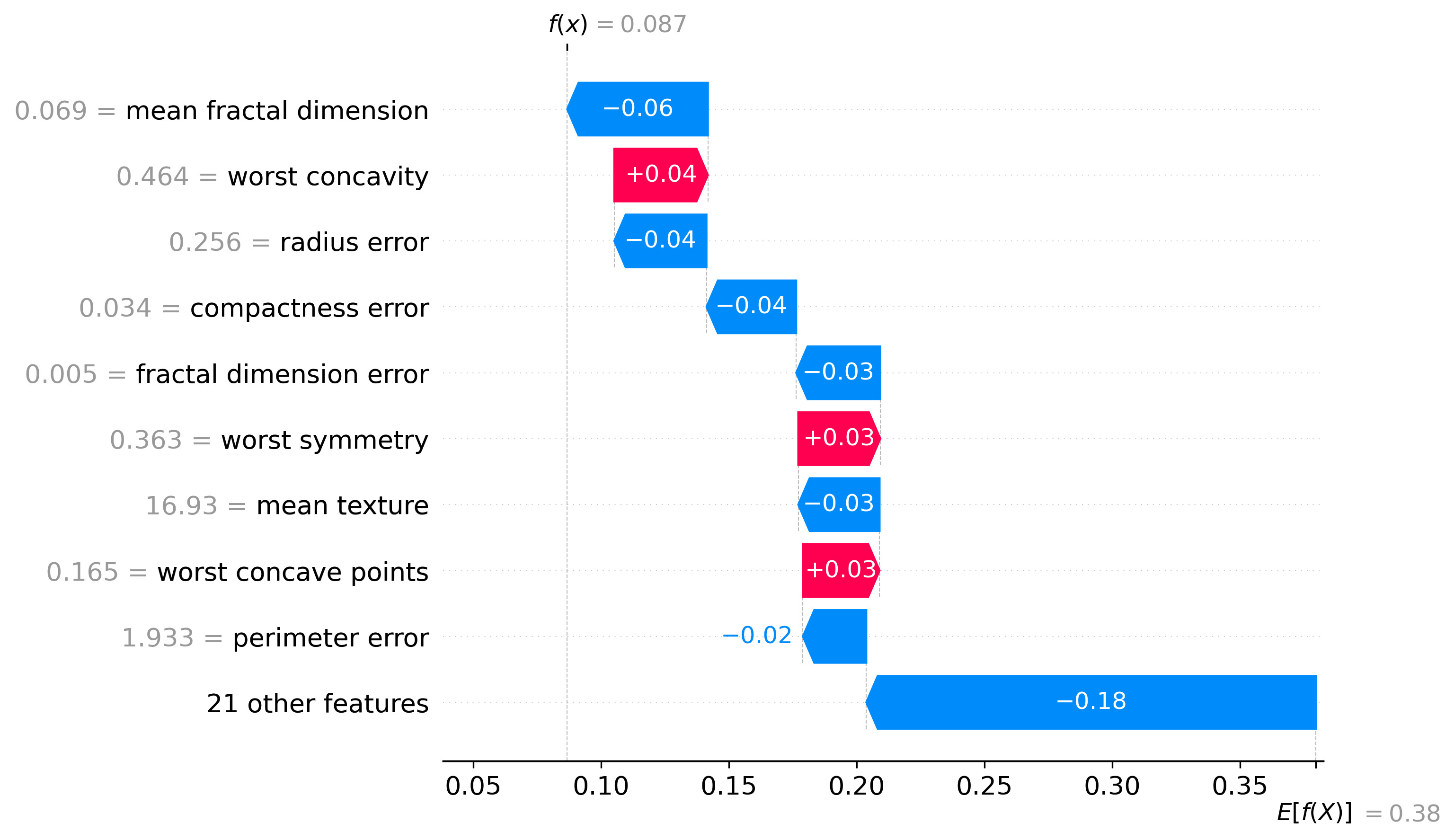
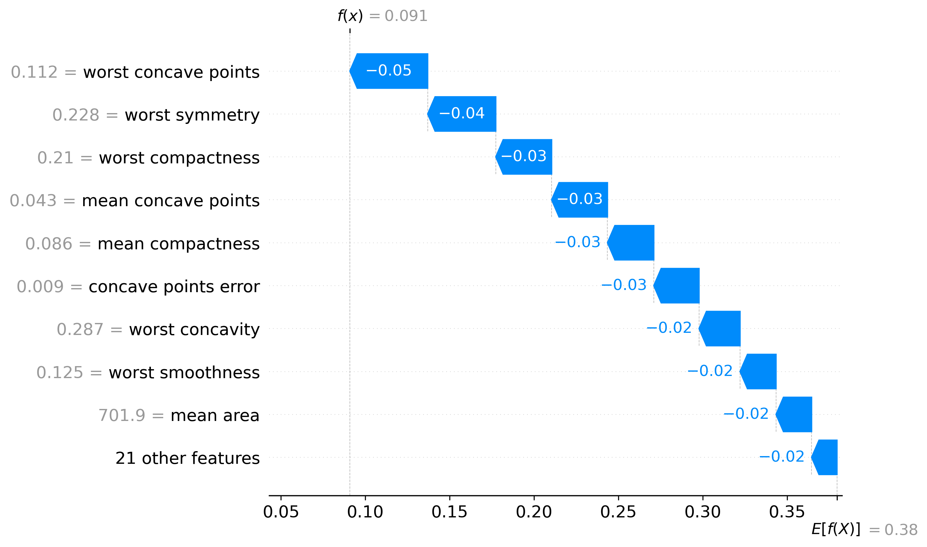
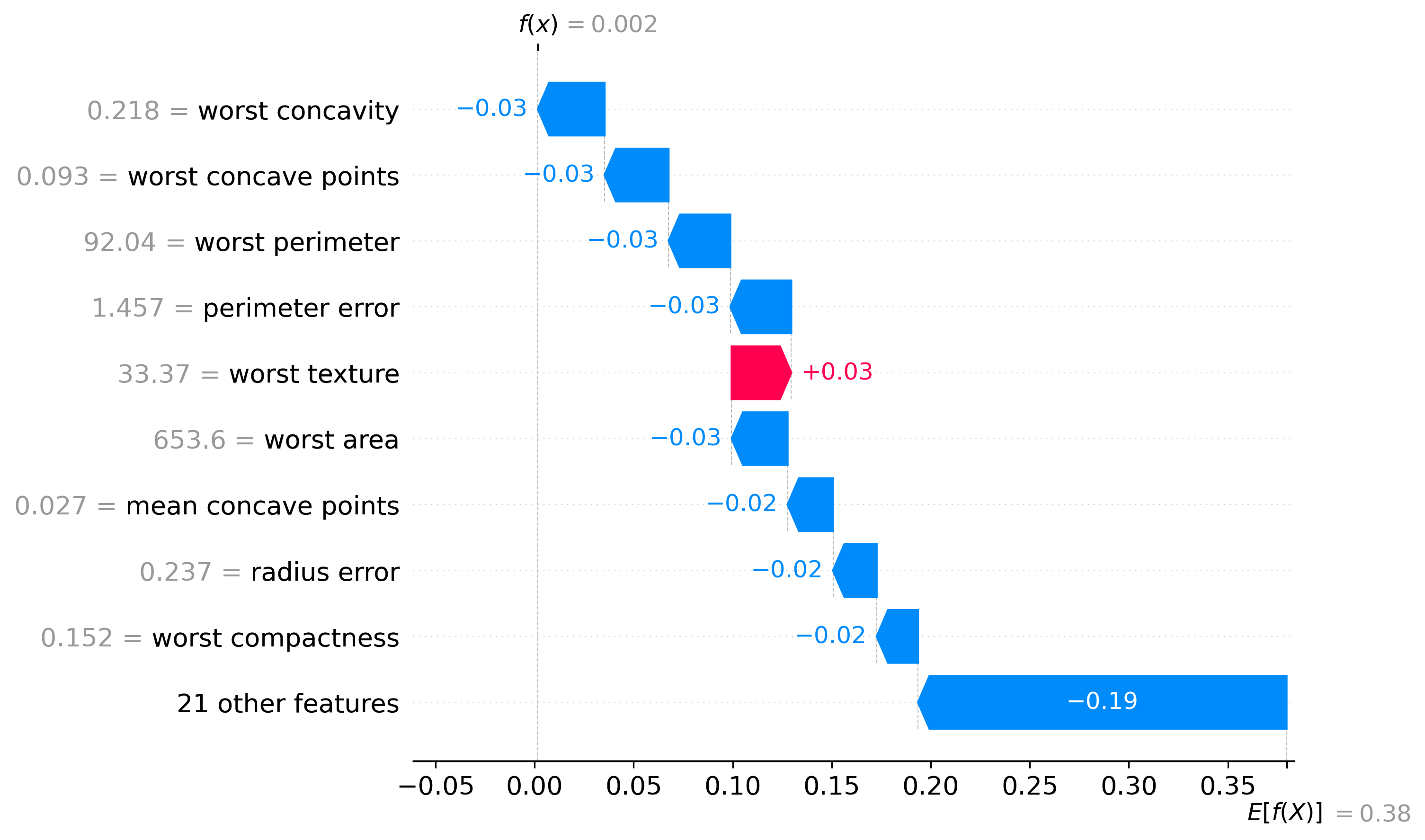
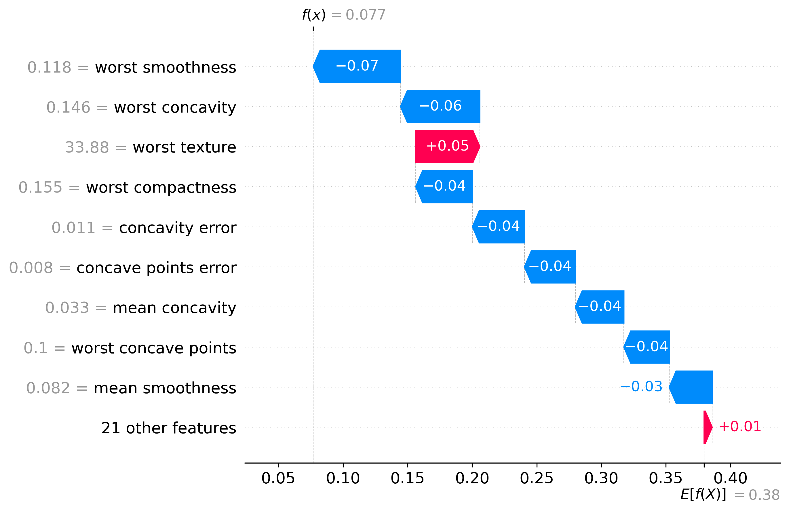
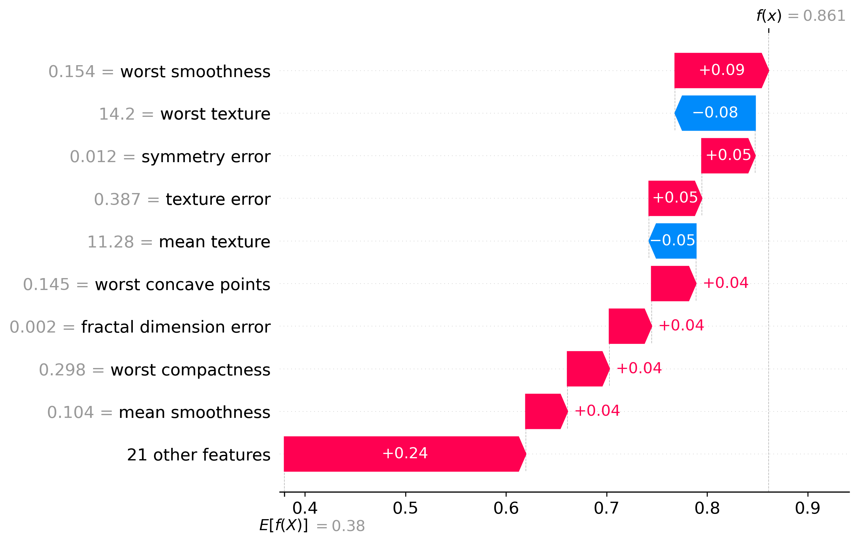
Classification Examples/Instances
In this section we can see how the classifier made some of its decisions, these are split into benign and malignant, which are instances were the classifier was the most confident about its decision, closest to the decision boundary, which are instances were the classifier was the least confident about its decision, and misclassified, which are instances that were classified incorrectly.
These plots are called waterfall plots, the f(x) means the predicted probability of the sample being malignant. The features are sorted by importance, with the most important feature at the top, and the least important feature at the bottom. The red arrow to the right means that the feature contributed to a malignant decision, and the blue arrow to the left means that the feature contributed to a benign decision, also the higher the value in the arrow, the more the feature contributed to the decision.
Benign
|
|
|
Malignant
|
|
|
Closest to the Decision Boundary
|
|
|
Misclassified
|

|
|
|
|
|