Welcome to the Breast Cancer Classifier Comparison Web
This web is designed as a complement to my Bachelor's Thesis, where I compare different classifiers to predict the diagnosis of breast cancer and then use eXplainable AI (XAI) to understand the decision made by the classifiers.
Slide to see more info
What is a classifier?
To understand what happens in the thesis and this web, we first have to understand what a classifier is. In machine learning, a is an algorithm that given some input it gategorizes the data into a class based on patterns that it has been trained to recognize.
In this case, we are using classifiers to predict the diagnosis of breast cancer based on the features of the dataset. So it will label the data as benign or malignant.
How Do We Compare Classifiers?
To compare these classifiers, we can use several metrics, but given the nature of the problem we will focus on the ones that help us to minimize the tumors that get predicted as benign when in truth they are malignant, they will get explained over the next sections.
Apart from this, we have confusion matrices which help use see with just four numbers how the classifier is performing. In the next section we will see one.
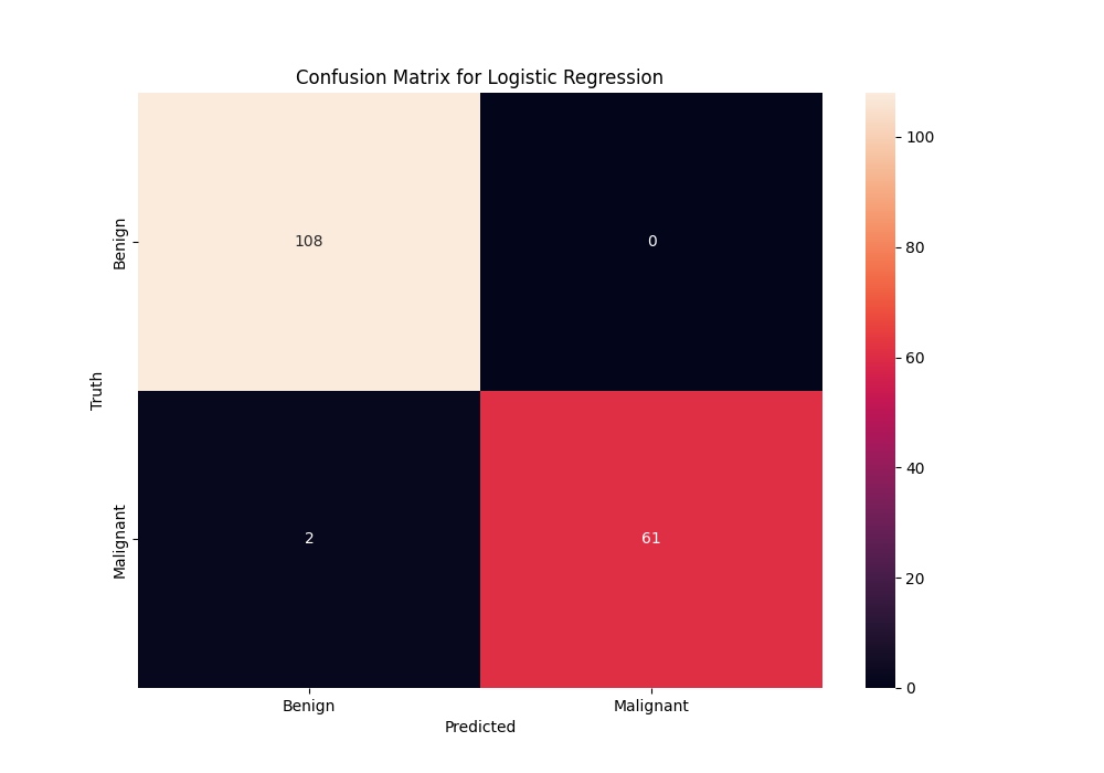
What is a Confusion Matrix?
Apart from these metrics, we can use a confusion matrix to see at a glance how the classifier is performing. It shows the number of true positives, true negatives, false positives, and false negatives.
What features are we using?
The Wisconsin Breast Cancer dataset is composed of features computed from an image of a fine needle aspirate (FNA). These features describe characteristics of the cell nuclei present in the image. Here are the key features:
- Radius: Mean of distances from center to points on the perimeter.
- Texture: Standard deviation of gray-scale values.
- Perimeter
- Area
- Smoothness: Local variation in radius lengths.
- Compactness: Perimeter² / area - 1.0.
- Concavity: Severity of concave portions of the contour.
- Concave Points: Number of concave portions of the contour.
- Symmetry
- Fractal Dimension: "Coastline approximation" - 1.
Each of these features is further divided into three parts: the mean, standard error, and the worst (mean of the largest values), resulting in 30 features.
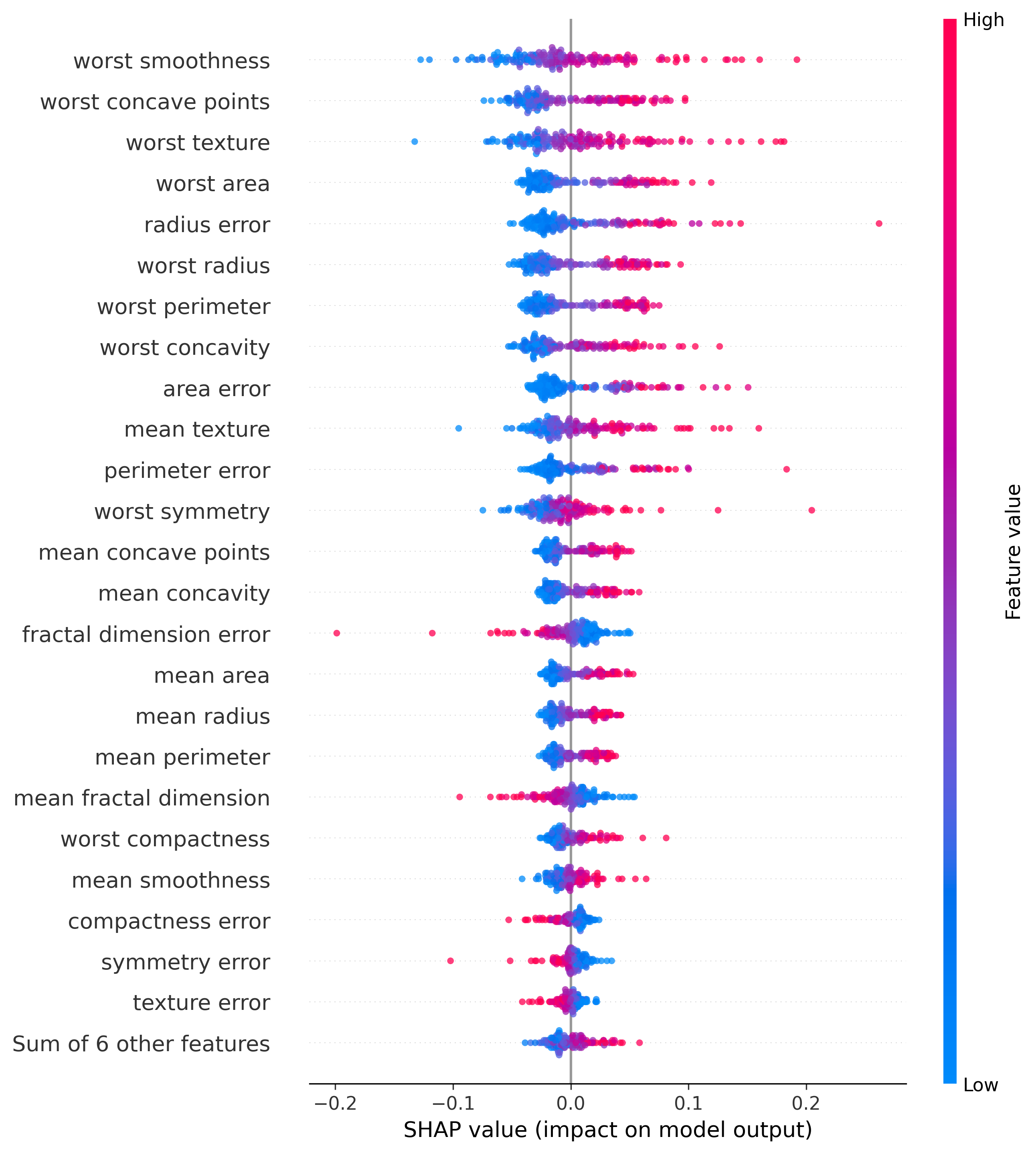
How do we see which features are important?
To see which features are important we will use SHAP, which explains the output of machine learning models. With this we will obtain a bar and a Beeswarm plot to see which features are the most important for the model. These plots will be understood better once it's seen in a real example (comparison or detail).
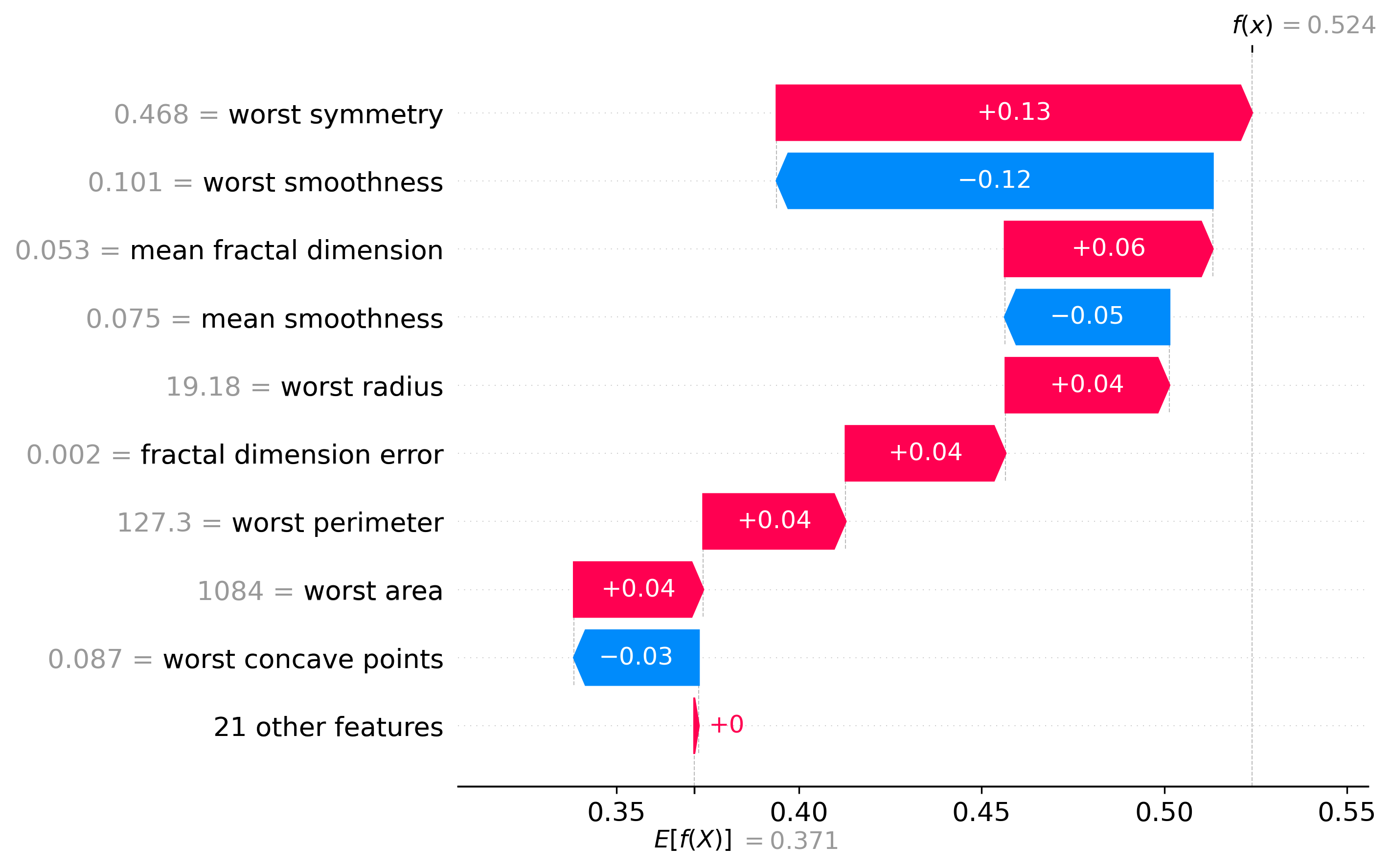
How do we understand the decision made
Using the SHAP values we mentioned before, we can see how the model made the decision it made. This will show a waterfall plot in which we can see how each feature contributed to the final decision.
This is really interesting because it is what makes the model interpretable and explainable, which is what could help a doctor to make a decision based on what the model is saying.
Important Note
The values shown in this web have been obtained using the Test Set (30% of the dataset), this is important to note because during the thesis we have used the Train Set (70% of the dataset) to train the models and used cross-validation to obtain the metrics to optimize the hyperparameters of the models. We just used the test set at the very end to see how the models performed on unseen data. So expects some differences between the values shown here and the ones in the thesis.